


CONCEPT
EXTREME LIVING
WITH AWARENESS
The YogaSlackers are an eclectic group known worldwide for their amazing slackline abilities and the generous sharing of their teaching techniques.Their practice of Slackline Yoga focuses upon putting the body in different asanas (postures) while balancing on a thin piece of webbing suspended over the air.The goal is to regulate stress responses and learn to connect with the calm centered self, regardless of the situation.The YogaSlackers teach in workshops and festivals all over the world sharing their unique practice.
The goal of the app is to create a dedicated platform for people interested in learning to practice Slackline Yoga. The intention to share easily accessible lessons available anytime inspired the concept of an app.The first release will provide a library of slackline poses and moves, the ability to save these poses to a personal training list and general information about the YogaSlackers.Later releases will include the ability to create a personal profile, slackline coaching features and the inclusion of slackline conditioning sessions.

OBJECTIVE
CHALLENGE

TATSU
SLACKLINE YOGA APP
- Provide an easily navigable and searchable library of slackline asanas (poses)
- Creation of a personal customizable section for users to save tutorials they are currently working on or would like to reference later
- Integration of a trackable progress metric for users to track practice goals over time
- The ability to connect with an expert slackline coach for personalized feedback on progress in order to advance their technique
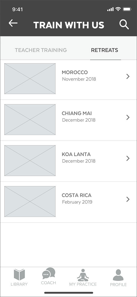
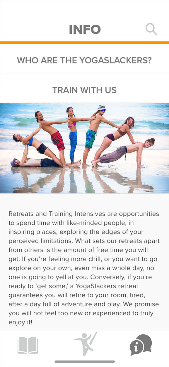
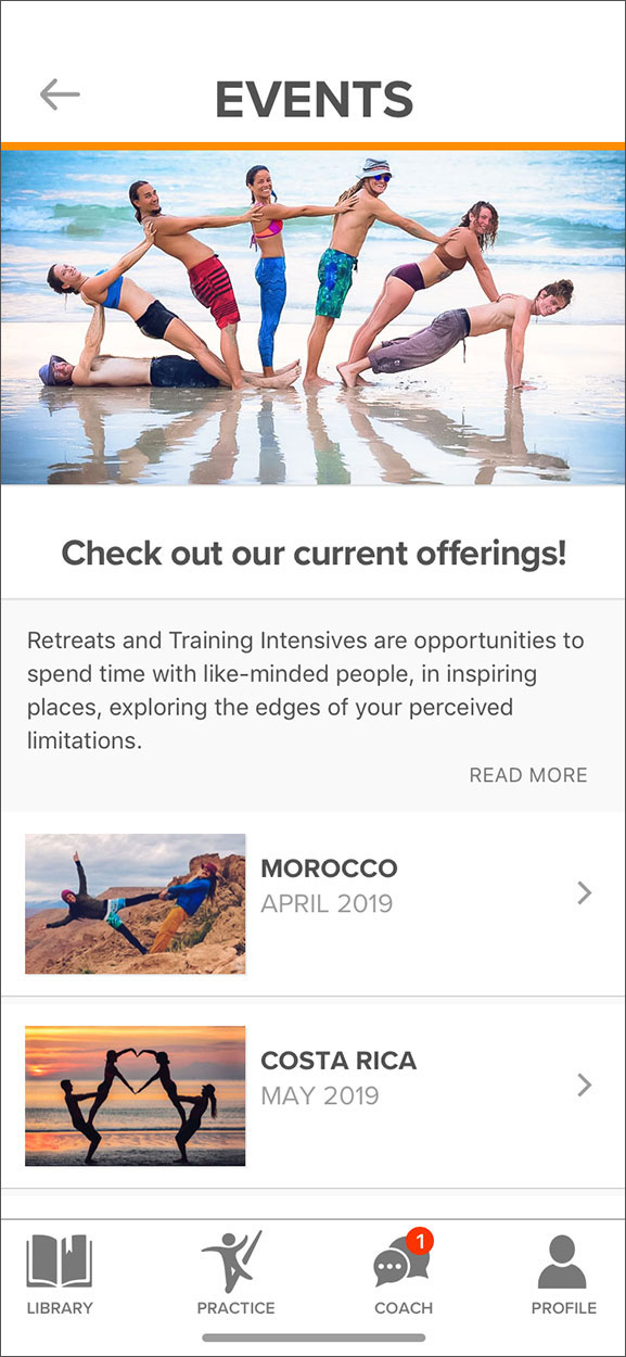
- Provide general information about the YogaSlackers: coach bios, retreats & trainings, and slackline safety concerns
- Provide a section to present YogaSlacker products, in specific eLine kits and T-shirts
- Social networking section to share progress with like-minded slackers
COMPETITIVE ANALYSIS
In order to understand the marketing potential of a slackline app I looked at the market for direct and analogous competitors to evaluate their offerings.Slacklining is a niche market at the moment, so currently there is only one existing slackline app and it is not a direct competitor as it does not focus on Slackline Yoga in specific. I expanded my analysis to include yoga and fitness apps which included tutorial libraries and coaching features.
For each app I carefully examined the library tutorial structure, coaching interface, navigation and overall functionality in order to understand common features of fitness learning platforms.
I focused on how easy the apps were to use and whether the features successfully accomplished the goals of the users. I critically analyzed these solutions and evaluated their strengths and weaknesses.
GIBBON SLACKLINES
Sports
GAIA
Mind, Body & Meditation
ALO MOVES
Yoga, Meditation & Wellness
YOGA INTERNATIONAL
Yoga, Meditation & Wellness
NIKE TRAINING CLUB
Fitness Training
UX ANALYSIS
USABILITY LEVEL
I paid specific attention to the ease at which I could move through each app, navigate through its features and find the information I was looking for within the interface, with a key interest in the organization of library tutorials & coaching features
NAVIGATIONAL STRUCTURE
I questioned the logic of each app’s user flows and navigational structure and evaluated whether the menu options were organized logically and clearly within a quickly understood design pattern
LAYOUT EFFECTIVENESS
I examined carefully how easily it was to understand the overall design of the app, its individual pages and structure. As fitness apps rely heavily on imagery, I studied how effective the visual design enhanced or complicated the content
POSITIONING ANGLE
I considered the qualities that made each app a unique competitor in the market and analyzed their strengths and weaknesses toward building that position

TATSU
ANALYSIS METHODS
- Competitor Profile
- Competitor Feature Matrix
- SWOT Analysis
- Competitive UX Analysis
USER RESEARCH
My next step was to gather qualitative information directly from people who are interested in learning how to practice yoga on a slackline in order to better understand their attitudes, needs and requirements.
I knew it was crucial to engage my target audience as early as possible in the process to test my assumptions about how they would use the app. By observing the emotions and thought process of actual users, I could begin to frame my hypothesis and problem statement within a real world context.
Although Jakob Nielsen’s law of diminishing returns states we probably only need five interviews from appropriate subjects, I did six just because they were so much fun and I love to talk about slacklining. I conducted my interviews in person and on Skype. All participants were either very interested in learning how to slackline or YogaSlacker teachers who would like to use the app to advance their practice and recommend it to their students.
All interviewees expressed excitement about the app and talked about how they couldn’t wait to use it!

TIME TO SLACK!
One of the best ways to truly understand users is to spend time with them in their own environment. Because of the highly specific nature of this app, it was crucial that the features align with the specific needs & goals of the users.
Interviewing and observing prospective app users actively learning how to slackline was extremely helpful for me to understand how they will enjoy using the app.
The app is to be used a learning tool to reference outside in the park, or wherever one is slacking for a quick reference on how to do poses and asanas, as well as serving as a platform to organize tutorials. So environmental studies were critical for the exploratory process.
I spent hours watching the YogaSlackers in action teaching fellow slackliners and spoke with many students on the learning process as well as simply observing them practice. These memorable experiences encouraged unique observations and understanding what slackers are looking for in a learning app.
INTERVIEW GOALS
DISCOVER
what fitness apps users currently use & what they like about them
EVALUATE
the friction/pain points of other apps & understand the user’s expectations are of the app
UNDERSTAND
what features will be most helpful & desirable for users to learn how to do yoga on a slackline

TATSU
USER INTERVIEW QUESTIONS
- Do you exercise regularly? What is your routine?
- Have you ever used a mobile app or website for your fitness routine? Which one? How was your experience?
- Does the app you use meet your expectations? What features would you like to have that aren’t currently provided in the app you use?
- What is your current experience with slacklining?
- What types of app features do you think would be most helpful for you to learn how to do yoga on a slackline?
- While the app provides a list of preset workouts and fundamentals, what types of features would be helpful for you to then create your own workout?
- Do you use a fitness coach? If so how regularly? Can you tell me a little bit about that? What are the most valuable features?
- Tell me about a time you’ve been frustrated getting help from a coach. Why was it frustrating? Is there something that could have made it easier for you?
USER QUOTES

It would be awesome to have a yogaslacking coach to give me feedback, especially if I am practicing alone without a friend out there to help.
For me- its alot about asking questions. I think it would be super helpful if I could send a video and ask questions and get someone to tell me what I could focus on to get the move.

Personally I am goal oriented person and its really great to see exactly what I am working toward. Then I understand step by step the progressions or things I have to do first in order to get there.

Would be great to have a way to track your progress for each asana/progression.
Fitness Routinues
It was great to hear the different viewpoints on how the interviewees approach the art of movement and in particular learning to do yoga on a slackline.
Mobile Fitness Apps
It was educational to hear about various mobile fitness apps used and perceived strengths and weaknesses.I learned quite a bit about the functionality and features offered by these apps.
Attitudes toward Coaching
It was also incredibly helpful to hear about attitudes toward creating and presenting video teaching tutorials. The interviewees offered many creative approaches toward organizing the user profile in order to make the most of the learning platform and provided suggestions for coaching features they would enjoy and thought would be beneficial.
Key Points
- All users responded extremely well to the idea of video tutorials and expressed the need for clear progressions
- Most users expressed the desire to create personal playlists of tutorials they liked and create their own sequences
- All users thought a progress tracking/metric system would be incredibly useful for the learning process
- All users were interested in some level of coaching on uploaded video progress, (chat or scheduling a audio/video call)
- Most users thought a chat feature would be great to receive feedback and they would be interested in paying for it
INTERVIEW ANALYSIS
After completing the interviews I had a bunch of data to sift through and organize.It was quite a challenging task to read back through my interviews and review all the details. I was very glad that I had recorded them so it was easy to take careful notes.
I looked for significant themes and trends which could would inform my user persona and journey maps in my next step. I began to break all the information down into small chunks so it would become more manageable and easier to categorize.
Using my research goals as a focal point, I looked for common behaviors and attitudes among my interviewees. I categorized needs and goals they mentioned as well as pain points and frustrations. I pulled out useful quotes and comments that were significant and informative.

TATSU
CRITICAL ANALYSIS
- Understand the attitudes, behaviors, motivations, and needs of a user who wants to learn how to do yoga on a slackline
- Determine what type of app features will be most helpful & desirable for these users and why they are valuable
- Discover what fitness apps users currently use & what they like about them
- Evaluate the friction/pain points of other apps & how to eliminate/minimize this
- Pinpoint specifically what the user’s expectations are of the app
AFFINITY MAPPING
Affinity mapping proved to be a very effective tool to group and understand my information.It was useful to help me identify the relationship between all these various components and start to make sense of it all. I used digital sticky notes to write out all my observations, quotes and significant points and then began to create clusters based on connections between them.
My clusters were built around the themes of user behaviors toward fitness routinues and apps in addition to attitudes toward coaching. You can see my mapping exercise below. The different colors represent the different interviewees.Creation of this affinity map was instrumental toward my ability to synthesize concepts and ideas based upon the interview results.
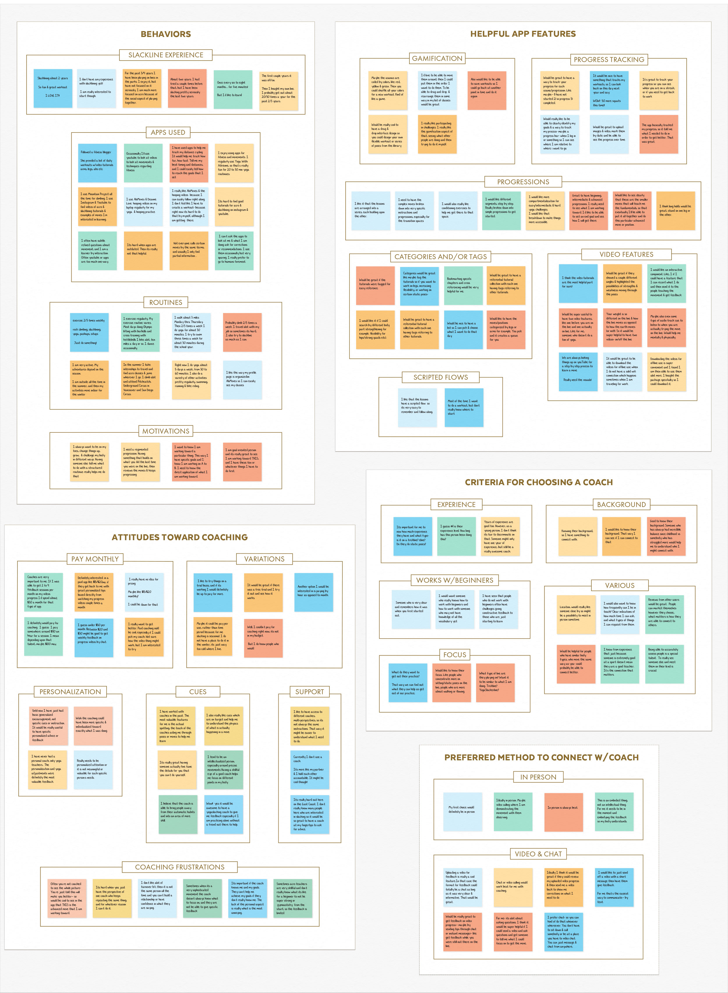
KEY INSIGHTS
All users enjoy physical movement and activity on a regular basis.
Users are tech savvy and have used some type of fitness app on some level.
Many regularly check instagram & youtube to research movements & technique
Users are excited at the idea of learning how to do yoga asanas on a slackine, including static poses & flows
Users feel that expert coaches can provide valuable feedback that the user cannot figure out alone
Users want individualized coaching feedback, not generalized encouragement or advice
USER PERSONAS
Significant themes and trends identified with my affinity mapping directly informed the creation of my design personas.
Focusing upon the user motivations, behavior and challenges I discovered with my user research I invented five key user archetypes to help provide insight and guidance for the development of the app.These personas helped me to clarify my user demographics, needs, goals, emotions, behaviors, fears and challenges.
The design personas humanized my users and provided a empathetic way to bring the customers’ perspectives to the forefront.By viewing the app through their eyes, I was able to understand what my fellow slackers were looking for in an app and how to create a product that be extremely useful and that they would would truly enjoy.

TATSU
CREATING PERSONAS
- Helped me to establish empathy with my users as I began to make decisions with the personas’ goals in mind
- Encouraged me to focus on prioritizing functionality based on the needs of the most significant personas
- Reinforced my design decisions based on the personas as they were based on real data from authentic users


TATSU
USER STORIES

As a beginning slackliner, I want to be able to easily search the library for poses I am interested in and add tutorials to my practice list.
—Zoey

As a yogi who is really interested in taking my practice to the slackline I want to be able to easily connect with a coach on a chat or video call to ask for feedback on my progress
—Jonathan

As a a traveler who is often in remote locations, I want the option to be able to download tutorials so I can check them out without relying on an internet connection.
—Drew
MENTAL MAPS & USER JOURNEYS
Now I was ready to start one of my favorite parts of the process! While the personas humanized my users and highlighted their goals and behaviors, creating mental model diagrams and journey maps were great ways for me to really begin to get inside the head of the user and connect with them emotionally through thoughts and feelings.
For each persona I created a journey map, detailing the mental and emotional process this persona would move through to achieve his/her goal. For example Catie wanted to search the app lexicon to learn how to do slacker stance, Drew wanted to purchase an Eline to practice his arm balances and Jon wanted to send his progress to a coach for feedback thru chat. I listed the primary tasks, connected them with the unfolding thoughts and most importantly for this stage- the emotional experience.
Check out the full journey maps exploration here.

TATSU
USER JOURNEYS
- Provide teams and stakeholders with confidence in the design as they are based on a solid foundation of research.
- Serve as useful tools to compare personas quickly, and when there are differences in the mental models, these studies inspire unique solutions
- Visualize the processes a user goes through in order to accomplish her goal
INFORMATION ARCHITECTURE
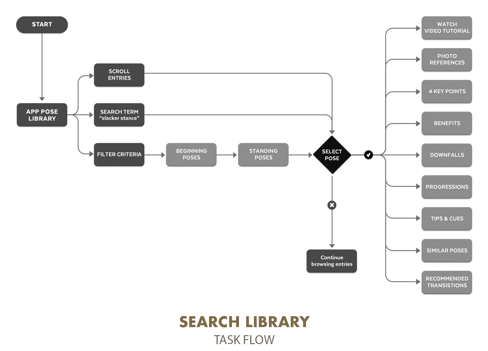
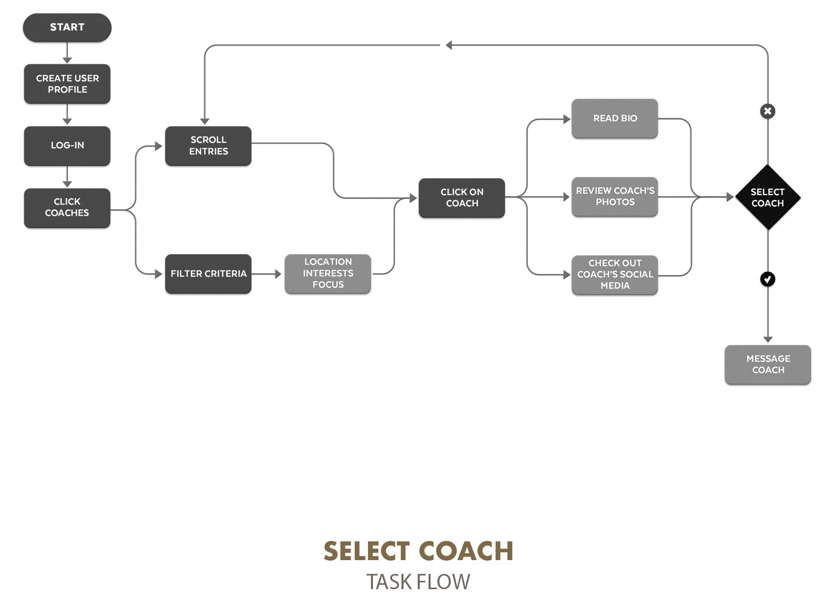
Task Flows: Now that I clearly understood the needs of my users, it was easy to identify the main tasks needed need to accomplish these goals. I was able to quickly map out the journeys that users would take through the information space of the app.
These task flow diagrams helped me to keep my eye on the big picture and not focus on individual pages or details. These charts also helped me to structure the paths that users would follow through my app in order to achieve their goals. Each user might choose a different path depending upon their specific intention, and explore different pieces of information along the way.
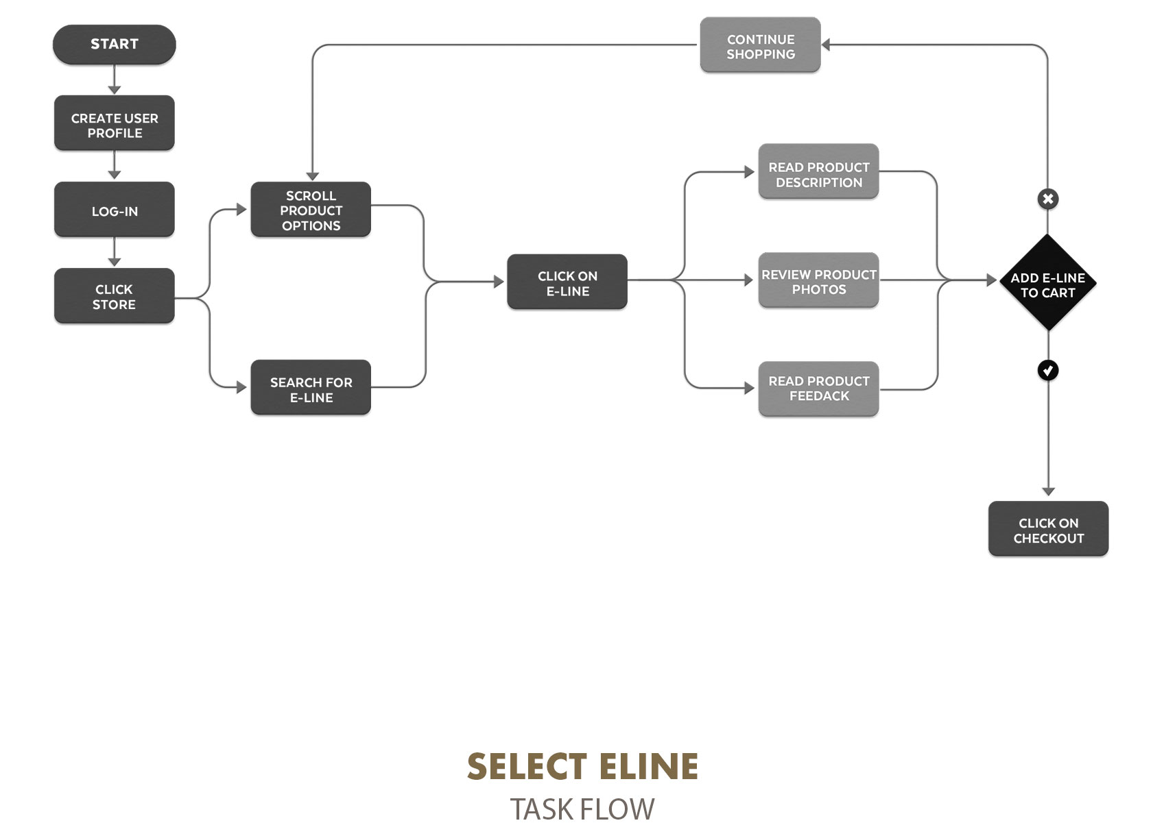
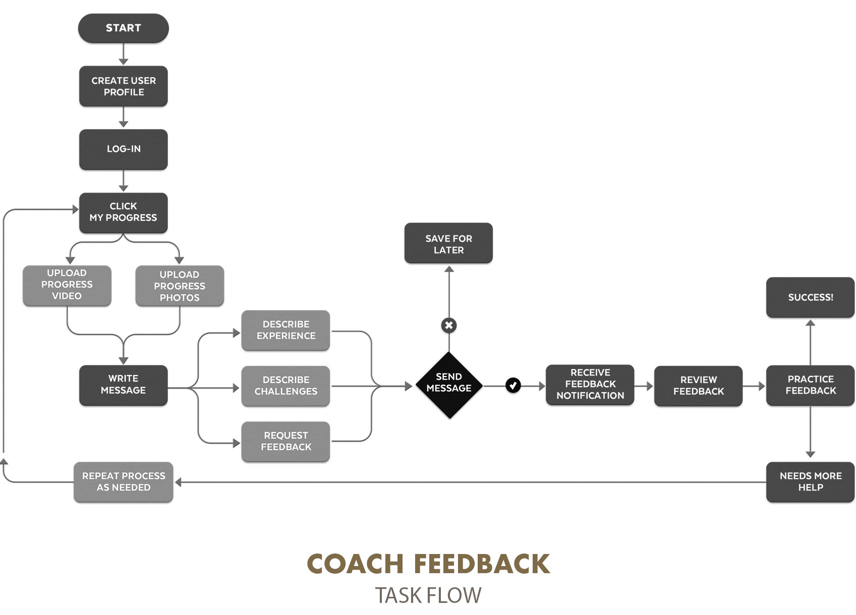
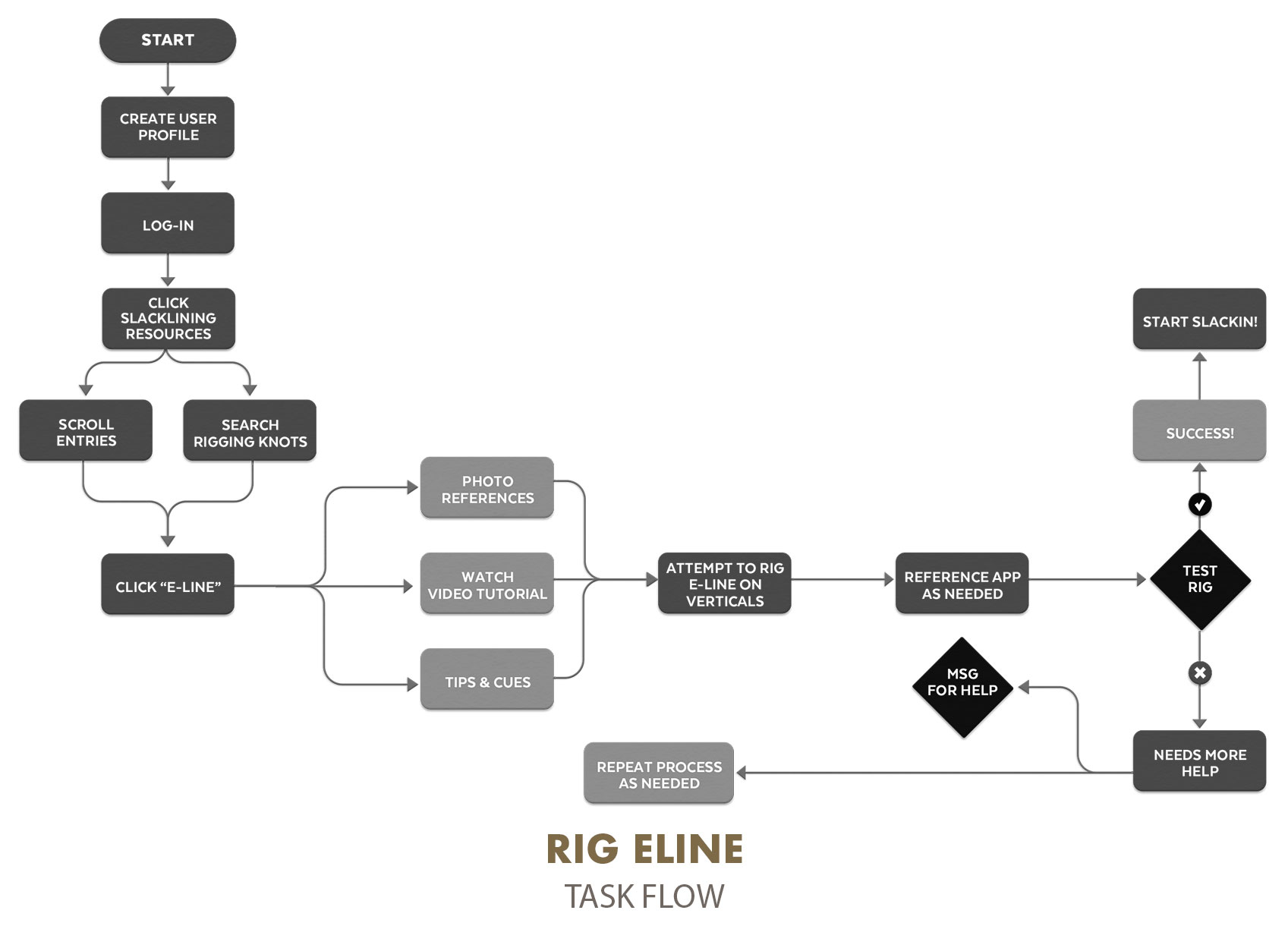
With the creation of these flows I was able to organize content, determine specific sequences of activities, and structure the navigational approach. The main flows I focused upon were searching the library, coach feedback, selecting products and rigging lines.
PROCESS
TASK FLOWS

PROCESS
SITE MAP
Time to really start bringing concepts together and construct the framework of the experience.
I began with the core of the app, the Library and used it as the anchor to build the other key features around. I used a number hierarchy to keep track of my pages and made sure to clearly delineate the features available for free from the paid features which come with the creation of a user profile.

PROCESS
CARD SORTING
At this point I needed to make sure that my initial approach toward the information architecture was making sense for the people who would use the app. I opted to do a digital card sorting session and used an online platform called Optimal Sort.
I created a bunch of content topics and asked my participants to organize them into categories that made the most sense for them. It was really easy and quickly generated results.

TATSU
CARD SORTING TEST
- Created content topics
- Sent participants a link online
- Participants grouped the cards in ways that made sense for them
- Optimal Sort offered a series of analytic evaluations for identifying patterns and trends.
- The similarity matrix and standardization grid metrics were especially useful to pinpoint cluster results and let me know I was heading in the right direction!
CONCEPT SKETCHES
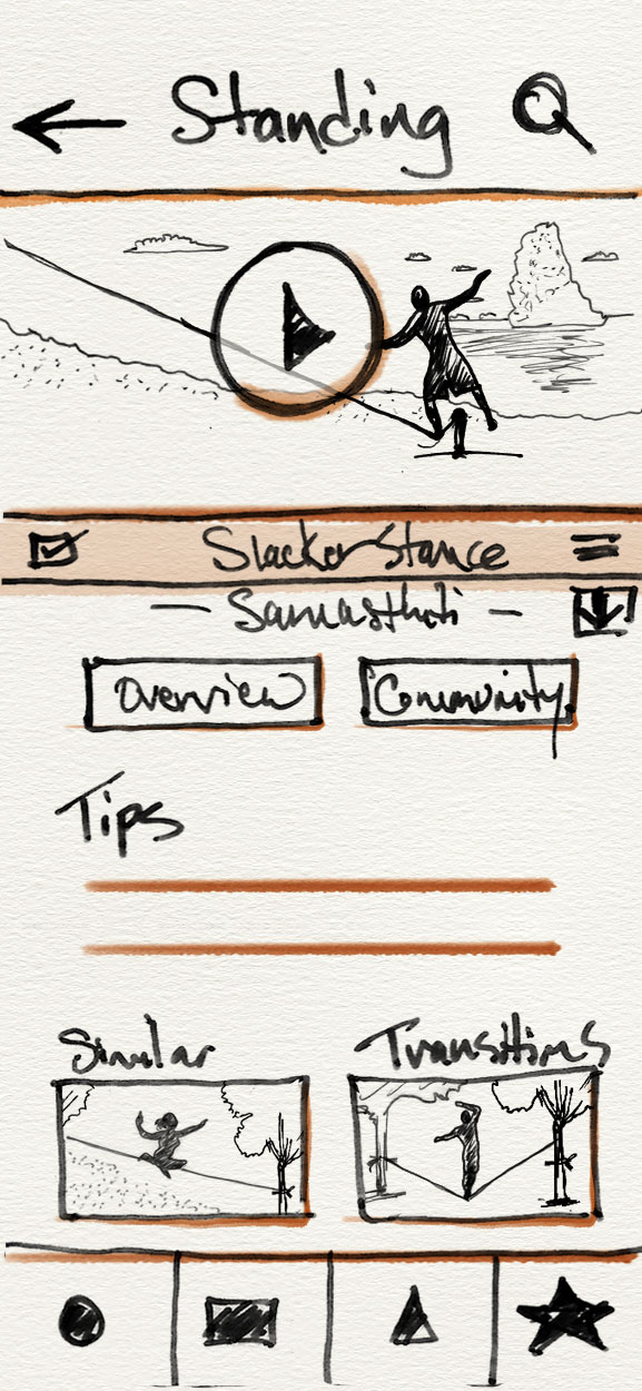
Next I quickly sketched out basic low-fidelity wireframe concepts exploring my initial design ideas. Sketches are great to explore lots of ideas in a short amount of time.One of the most wonderful things about a sketch is that it acknowledges the incomplete nature of ideas and leaves room for visual exploration and ideation. Its one of my favorite parts of the design journey.
Working rapidly and using grid paper for consistency I was able to create multiple ideas for various parts of my app without spending the time to fully flesh each concept out. It was great to get all the ideas out on paper in some form and then be able to look back at them all as a group to see how they might work together.

WIREFRAMES
Building upon my sketches I created digital wireframes so I could start to see a visual representation of the interface. I examined the concepts I had explored in my rough sketches and though about how to push them further. I brainstormed solutions to create the structure and behavior of my app.
The wireframes were an exciting step as they demonstrate my initial research and ideas coming together in a tangible form. Starting with these low-fidelity frames, the mockups allowed me to focus on the fundamental structure and navigation over beautiful visual design and complex features.
Using my hand drawn sketches as a guide I was able to quickly build my first digital mockups in Sketch. Symbols and styles made building the templates easy and quick. Expanding upon the task flows I created in my information architecture exploration, I constructed user flows, building connections between the wireframes.
PROCESS
USER FLOWS
LOG SLACK SESSION
USER FLOW
I’d like to log my slack sessions so I can keep records of my achievements and watch my progressions.
GOAL
Create a series of logged activity so he can see his slackline practice evolve and elevate over time.
SUCCESS CRITERIA
Create logs of his slack sessions which record activity and date.


Check out eLines
USER FLOW
I want to check out the slackines the YogaSlackers have for sale, in specific the eLine.
GOAL
Check out the items the YogaSlackers have for purchase & select an eLine
SUCCESS CRITERIA
Find the store and explore the items the YogaSlackers offer for purchase & select an eLine.
.

PROTOTYPING
Rapid prototyping is an integral part of the process in order to determine the best possible solution for design problems. Over and over I applied this principle to all levels of design fidelity.The goal here is to iterate quickly on prototypes and revise/add higher fidelity as necessary until finally arriving at the high-fidelity prototype.
Prototype. Review. Refine. Repeat as needed.
I started the process by taking my hand drawn sketches and converting those into a rough prototype, reviewing it with prospective users and then refining that prototype before I took things to the next level. I repeated this process with the wireframes and two stages of higher fidelity mockups with the goal of simulating the future state of the app and making sure the users clearly understood how to operate key functions.
PROCESS
ITERATIONS


USABILITY TESTING
After building my initial prototype, I was excited to measure its usefulness by watching real people interact with it. My goal at this stage was to evaluate the ability or inability of users to complete specific tasks with my app and find out how well it was actually working for my users’ needs.
I designed a usability test plan and script which included the primary tasks I had previously identified. Also included were demographic information and background.
Would the users be able to complete their key tasks using my prototype?

TATSU
TESTING CRITERIA
- Navigate the Library to find a specific pose
- Add a specific pose to My Practice
- Update the status of pose from “In Progress” to “Achieved”
- Explore the YogaSlacker retreat offerings
- Locate the YogaSlacker Eline kit within the purchase offerings
- Send feedback to coach
- Log Slack Session
TATSU
USABILITY TESTS
I conducted usability tests both in person and remote on low and hi fidelity prototypes. As the participants completed the requested tasks I took detailed notes. I carefully watched the efficiency, ease and speed with which they approached each task and evaluated their process.
Usability tests are a great way to evaluate what people say and do while interacting directly with my product and provides valuable insight on how to fix problems that may appear along the way!
It was great to connect with the potential users directly and see how they interacted with the app in progress. Lots of constructive criticism was offered and the feedback overall was very positive. All users were enthusiastic and expressed excitement about using the app upon release.

AFFINITY MAPPING
USER TESTING


TATSU
ANALYZING TEST RESULTS
I synthesized my notes and observations into a usability test report and jumped back in to work on my revisions, making modifications based directly on feedback and observation.
RAINBOW SPREADSHEET
-
The Rainbow Spreadsheet was a useful way to organize the information I gathered from my usability tests. By creating visual patterns the chart tracks the errors users made, the frequency of these errors, and how severe they are.
SEVERITY RATINGS
-
I used Jakob Nielsen’s four-step rating scale to classify the errors and rate them by severity, prioritizing what to fix.
I repeated the prototyping, testing and refinement process several times, each time measuring the usefulness of that current iteration, updating, tweaking and revising to improve and ensure the app was designed with the users needs and challenges at the forefront.
TESTING
TEST RESULTS

BEFORE TESTING

AFTER TESTING

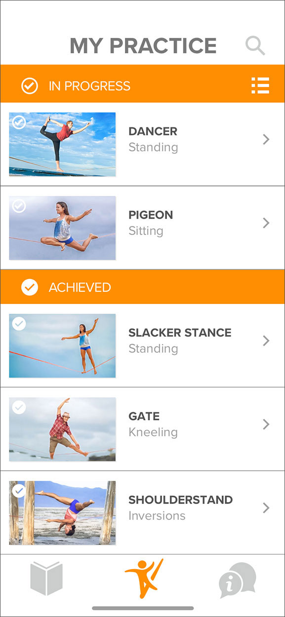
LIBRARY OF SLACKLINE POSES
FEEDBACK
- Users wanted to see a menu callout for the “Categories” option in the Library dropdown menu in order to easily navigate back to the Library main screen after viewing other categories
- Users thought the type seemed too small and difficult to read because of the color contrast
REVISIONS
- Add a field for “All Categories” in the Library dropdown
- Enlarge font and spacing for menu and check for Accessibility standards compliance
- Change menu background color and check for Accessibility standards compliance

MVP

EXTENDED APP
NAVIGATION MENU
MVP
- Core features of the app
- Learn tab contains info about the YogaSlackers, Retreats, Safety and Gear
EXTENDED APP FEATURES
- Addition of a User Profile
- Addition of Coaching capability
- Features previously in the “Learn” tab of the MVP are now accessed by a hamburger menu located in the top left corner

BEFORE TESTING

AFTER TESTING

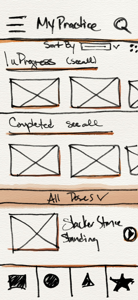
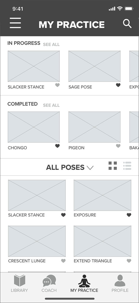
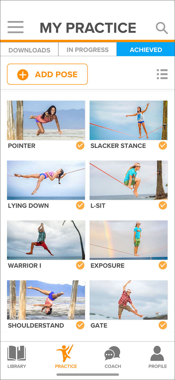
MY PRACTICE
FEEDBACK
- Users wanted a way to directly add poses from the My Practice screen
- Users wanted a faster way to access the three screen options instead of scrolling down
-
One user also mentioned that the additional features might not even be seen sometimes if they had to scroll down through a bunch of entries.
REVISIONS
- Add a plus icon/add feature at the top of the screen
- Add three tabbed segmented menu option at the top of the screen for Downloads, In Progress & Achieved

BEFORE TESTING

AFTER TESTING
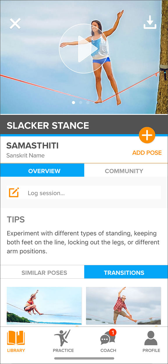
LIBRARY ENTRY
FEEDBACK
- Some users did not understand the pose name in Sanskrit
- Users were confused by the visual representations of the early status button or failed to realize the icon had changed to indicate a new status
- Users wanted to see the imagery larger
REVISIONS
- Add descriptor which identifies the Sanskrit name
- Revise status icon so it is eye catching, visually distinct and communicates function clearly
- Add callout below status button to emphasize current state
- Add pulldown menu for the status button which displays labels next to the icon choices (*see directly below for breakdown of states)
- Make picture/video larger
- Add download feature for offline use
- Log session tab added for the second stage of the app

STATUS BUTTON STATES
- Status button activated
- Dropdown menu appears with callouts beside icons for clarity
- Hover state is indicated by bright blue highlight
- Desired state is selected and button reflects new state
UI DESIGN

Now, finally it was time to create the high fidelity screen designs!
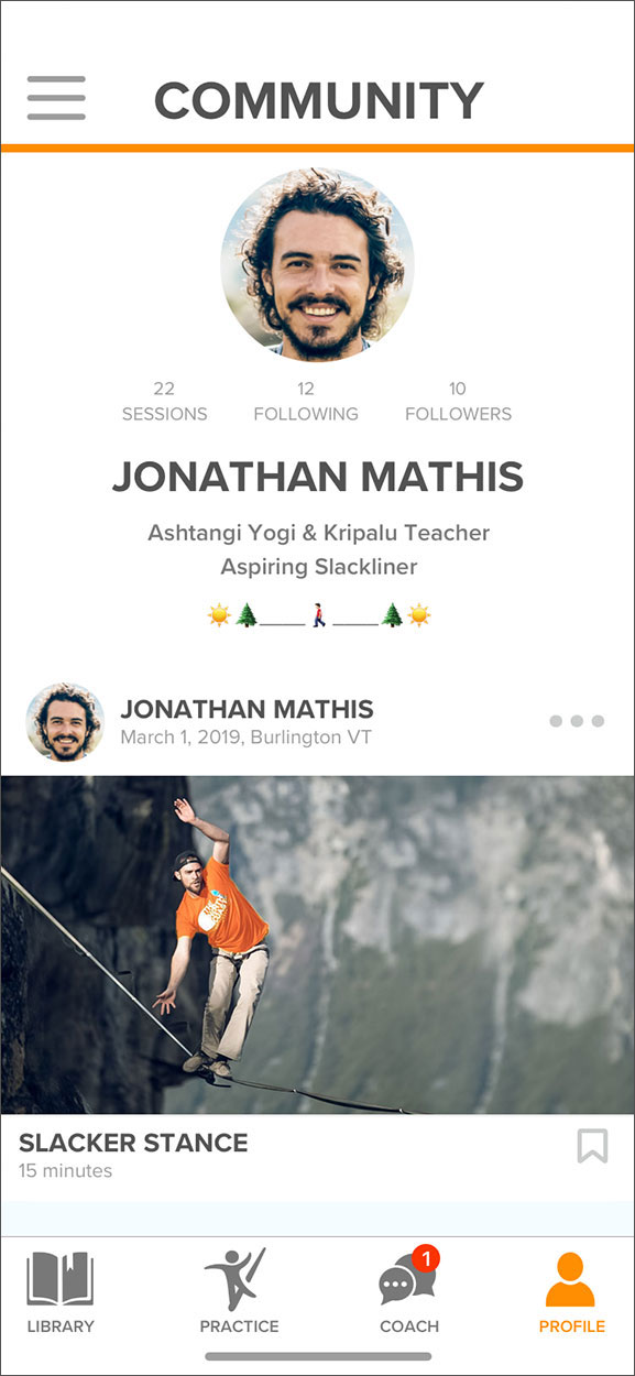
Layout kept simple and elegant to showcase the gorgeous YogaSlackers imagery.The photographs and video tutorials focus on the Slackers as they pass through awe-inspiring moves and positions.
Language is relaxed, authentic yet professional in order to inspire connection, reliability and the assurance that the Slackers know exactly what they are doing and are able to create a safe space for an activity that may be initially seen as intimidating.
Consistent design language is established which builds trust upon a behaviorial experience level. The navigation is straightforward and the flows make sense. Users can download the app and start learning in seconds.

Color palette of bright orange and blue reinforce the branding and also make the visual layout appealing.These vibrant punctuations of color establish a friendly design language communicating excitement and energy.
Orange is the primary accent within the app and is the main color of the YogaSlackers.It is the color of all the Elines that they use.Orange also has the symbolism of safety, it is bright and visible.While the line is up, people who are not slacklining will easily see it and not run into it.Therefore orange has become the color of the app’s CTAs.Secondary blue accents provide a calm balance and complement the bright orange.

ONBOARDING & TUTORIAL

POPOUT MENU

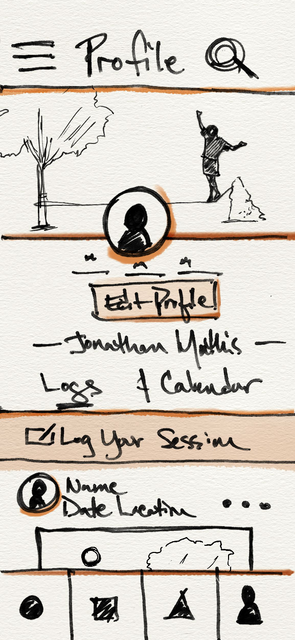
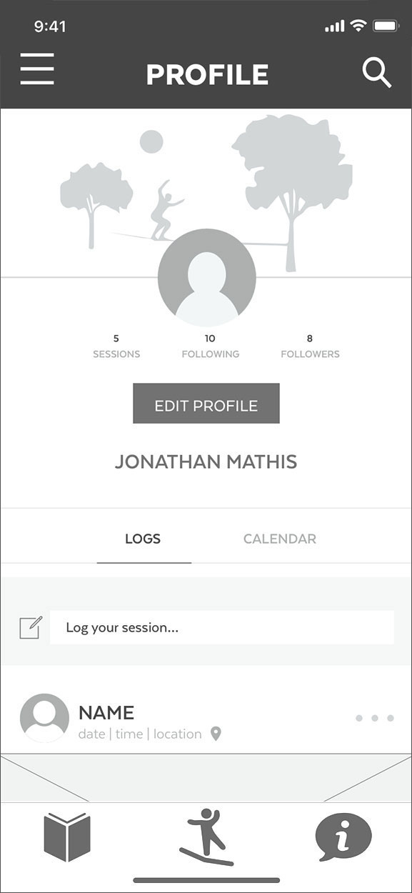
USER PROFILE
UI DESIGN
KEY FEATURES

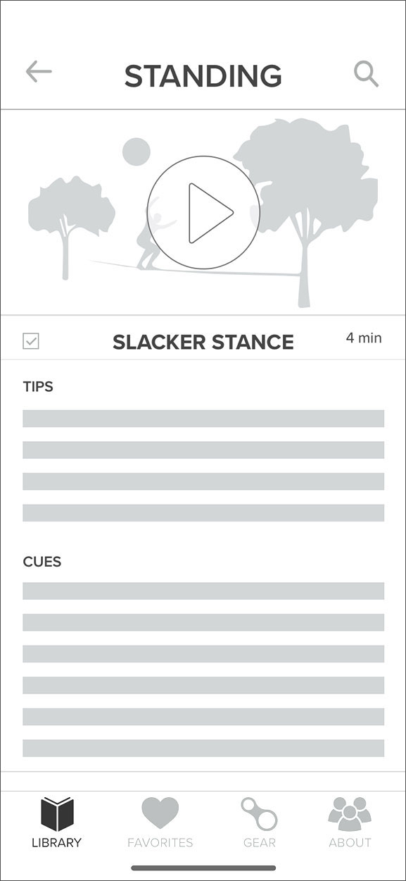
LIBRARY OF SLACKLINE POSES
- Photos and video tutorial
- Add pose to My Practice
- Change status of pose from “In Progress” to “Achieved”
- Download video for offline use
- Offers tips & cues
- Similar poses & transitions
- Log Slack Session
- Check out the community and see who’s been slackling lately and working on the pose

MY PRACTICE
- Save poses to practice list for easy reference
- Organize poses by “In Progress” or Achieved
- Save downloaded tutorials to watch later while offline
- View poses in grid or list view


CHAT W/COACH
- Send progress to coach via chat
- Receive feedback from coach
- Schedule video call w/coach on calendar
- Log sessions and view slack days on calendar
UI DESIGN
DESIGN SYSTEM
In order to ensure visual consistency for further app development I created a design system. The document includes rules and guides for colors, platform patterns, iconography, sizing, graphical and visual style. The intention for creating this document was to make it easy for the Slackers to be able to extend the app aesthetic to other platforms in the future.


UI DESIGN
SCREEN DESIGNS


GRATITUDE
So much gratitude and respect to Sam & Raquel of the YogaSlackers for constantly inspiring me with their dedication to the art of slackline yoga and their generosity with patiently sharing their practice.
Love and appreciation to all slackers everywhere!

© YogaSlackers | Slacker: julislackline96