Hoot is a mobile application for learning vocabulary.
This case study explores the experience of memorizing and understanding new concepts, techniques, and terms by carefully researching how people learn vocabulary and then designing a mobile app to address their goals and challenges.
CHALLENGE
DESIGN PROCESS
My overall goal while creating the Hoot Memory App was to bring ideas to life based on how real users think, feel and behave while reconciling this with technical feasibility and business viability. To do this I needed a framework to tackle my practical problem from a design perspective, so I adapted the design thinking methodology pioneered by IDEO and the Stanford Design School.
Empathise, Define, Ideate, Prototype & Test.
As I learned along the way, my process would not be linear, but fluid, organic and iterative, as new insights and revelations appeared at various stages altering and rearranging the order of the steps. Based upon research, testing and observation, throughout the process I explored fresh ways of viewing my app and the possible uses it might have while I developed a greater understanding of my users and the challenges they face.
COMPETITIVE ANALYSIS
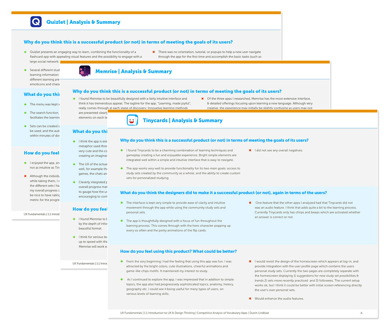
In order to understand how to design my product, I needed to understand the problem space. I needed knowledge of the current market with the strategies and values of the competitors. In order to do this I identified three mobile apps that focused on vocabulary learning and conducted a competitive analysis, assessing the positives and negatives of each. The three apps I selected were Tinycards, Quizlet and Memrise.
For each app I carefully examined the onboarding sequence, navigation and overall functionality to get a feel for the types of issues related to learning vocabulary. I wanted to examine solutions that have already been proposed and evaluate their strengths and weaknesses.
I focused on how easy the apps were to use and whether the features successfully accomplished the goals of the users. I thought carefully about how I felt using each app and what I might do to make the experience better.

USER RESEARCH
After familiarizing myself with the current product landscape, I needed to gather some qualitative information directly from people who are familiar with and enjoy using vocabulary apps to better understand their attitudes, needs and requirements.
I knew it was crucial to engage my target audience as early as possible in the process to test my assumptions about how they would use my product. By observing the emotions and thought process of actual users, I could begin to frame my hypothesis and problem statement within a real world context.
I interviewed eight people in person and on Skype. All of the interviewees were interested in on-going education and most had used educational or vocabulary learning apps within the past six months and were able to provide useful insight and feedback.
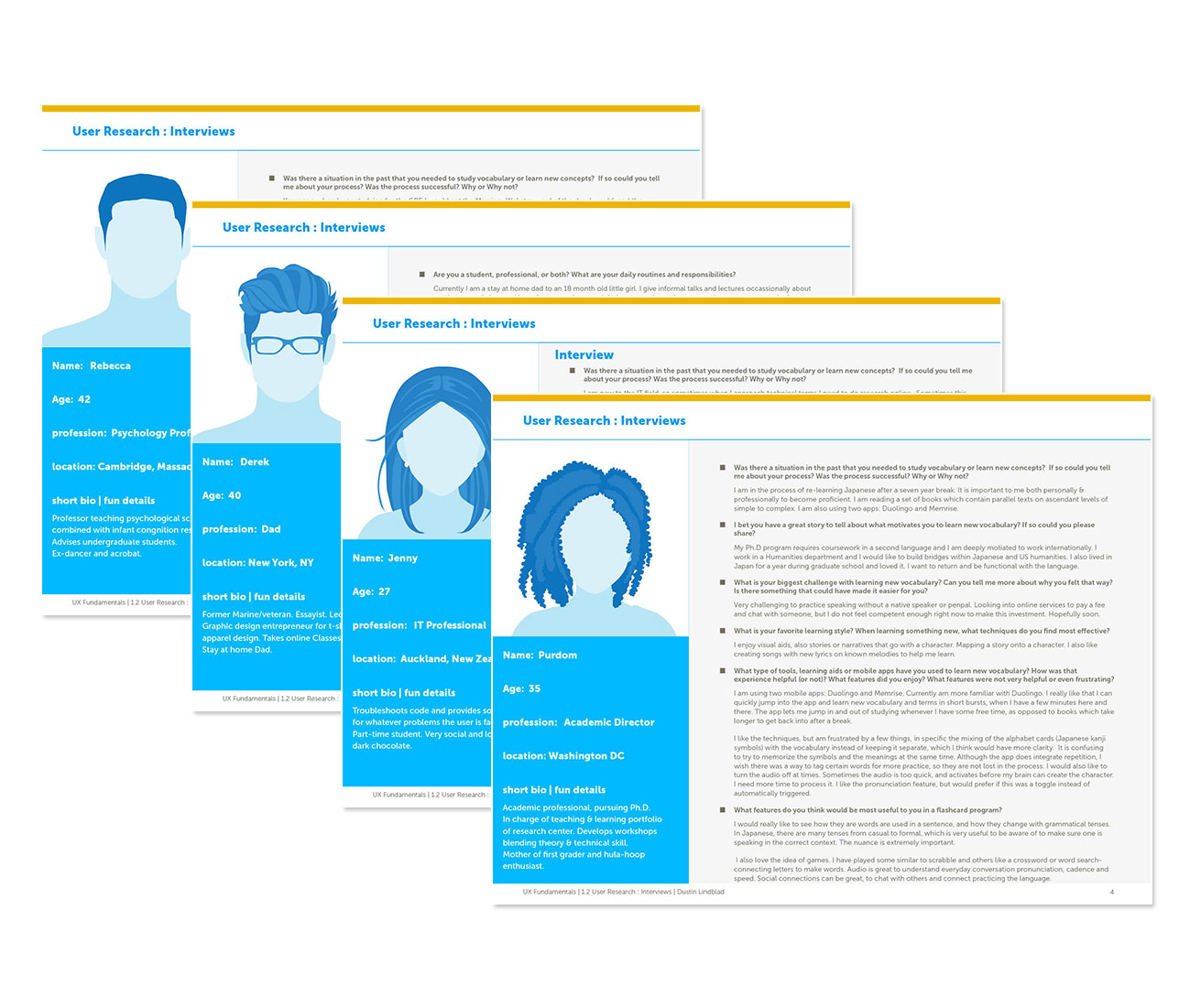
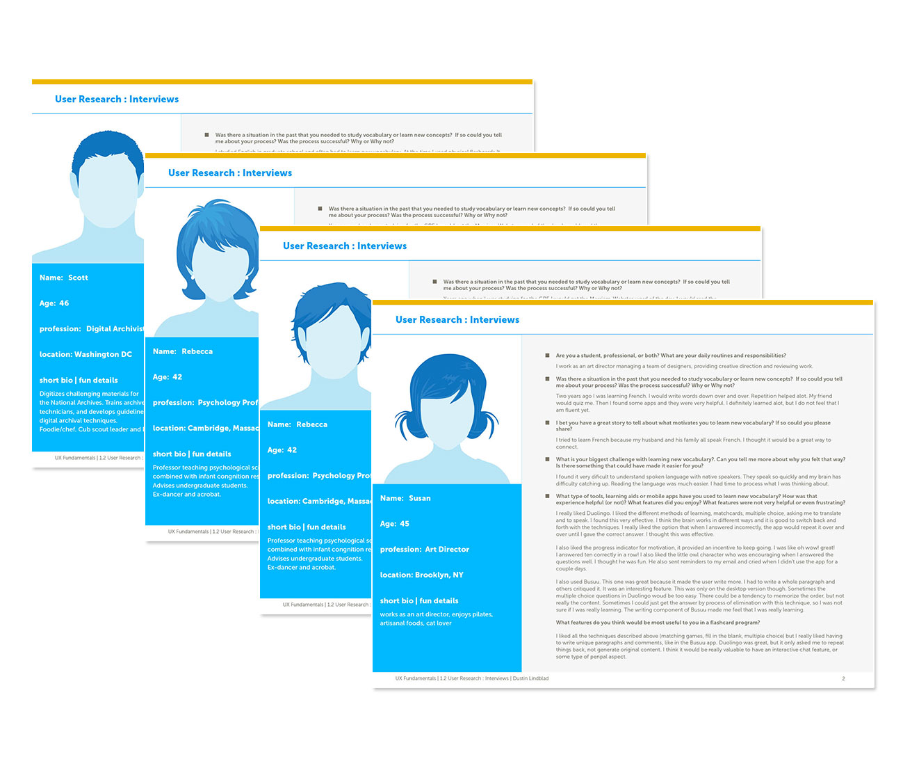
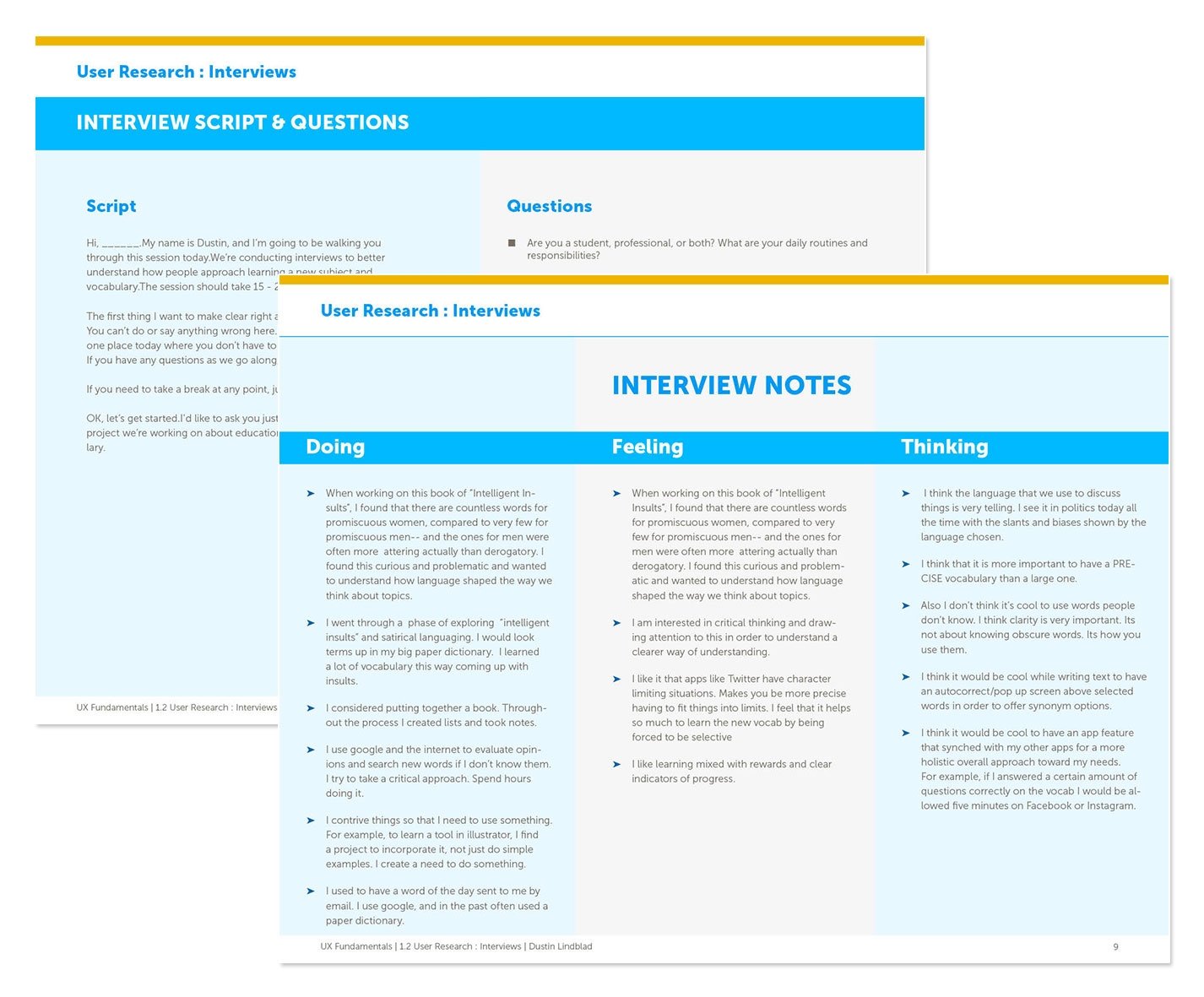
To obtain useful feedback I needed to ask the right questions, so I carefully developed a script of questions to discover the fundamental motivations for the user’s behavior and the sources of their challenges. I kept the interviews short and my questions simple with the goal of identifying tangible examples of behavior around the user’s fundamental needs and pain points.
Analytically observing the thoughts and feelings of the users I then organized my notes from the interviews, summarizing what my interviewees were doing, thinking and feeling with the goal of stating the results from the user’s point of view.
USER PERSONAS
At this point in the process I wanted to synthesize all the data I had been collecting into something meaningful and enter the conceptualization phase of the design thinking process. Taking my inspirations I began to create the first full-fledged ideas for my app, focusing on identifying my user’s goals and understanding her point of view.
To humanize my users and highlight their goals and behaviors, I created several personas based upon my research. The personas helped me to clarify my user demographics, needs, goals, emotions, behaviors, fears and challenges. By bringing my customers’ perspectives to the forefront, I was able to restate my project brief in the form of user stories, job stories and a problem/hypothesis statement.
Moving forward, the goal for my personas would be to generate empathy for my potential users, leading me to more concrete ideas and strategies, and helping me to hypothesize clear actions that my users might take while using the memory app.
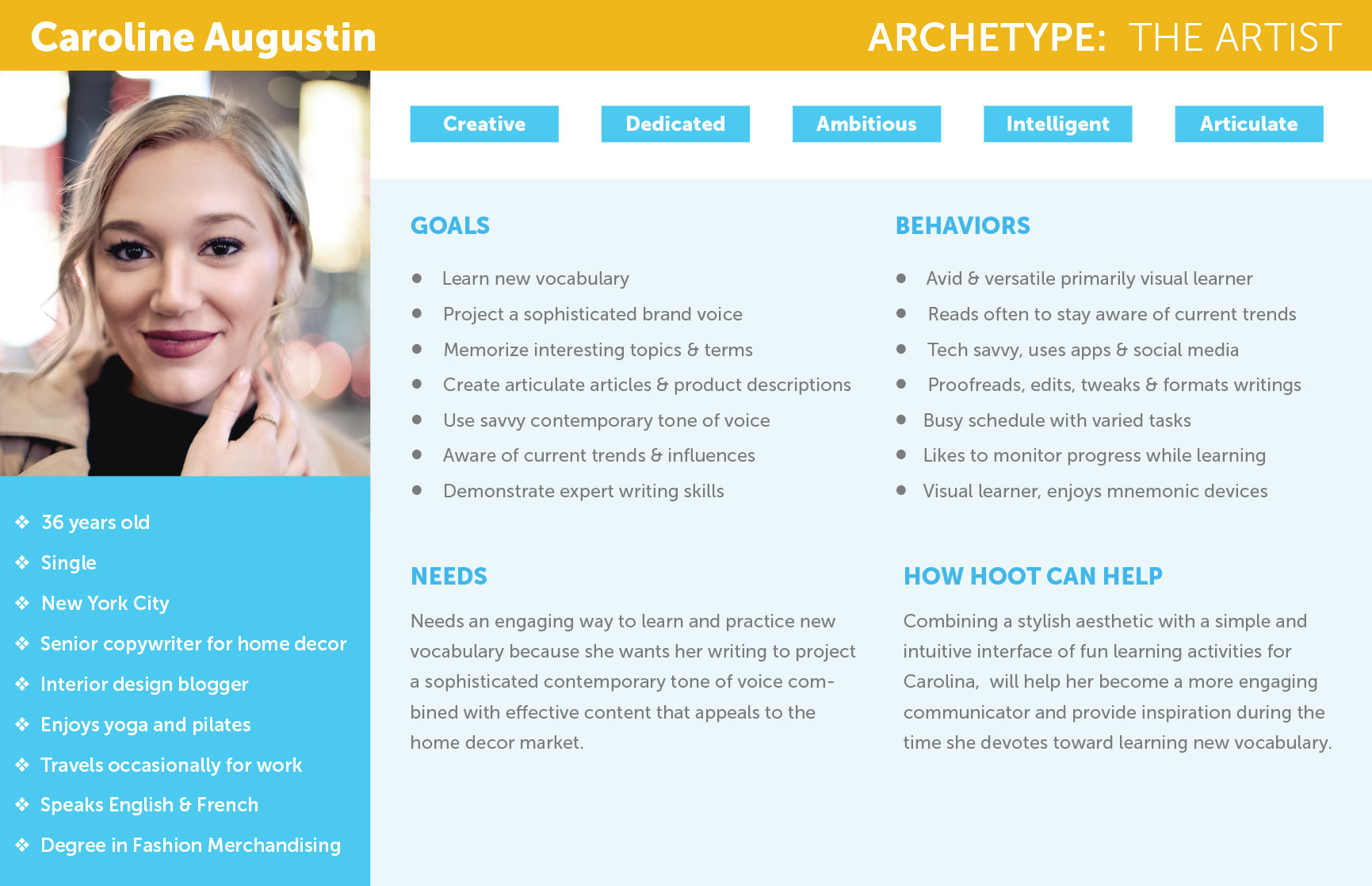
“As a creative professional, it’s important for me to project a sophisticated contemporary voice for our brand in order to appeal to the home decor market. I want to create content that connects to my audience through my vocabulary, that way customers will resonate with the brand lifestyle and purchase my company’s products.” —Caroline
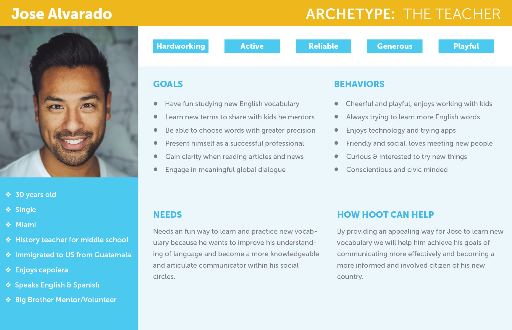
“As a non-native English speaker, I want a fun way to stay inspired and motivated while I am learning new vocabulary.” —Jose
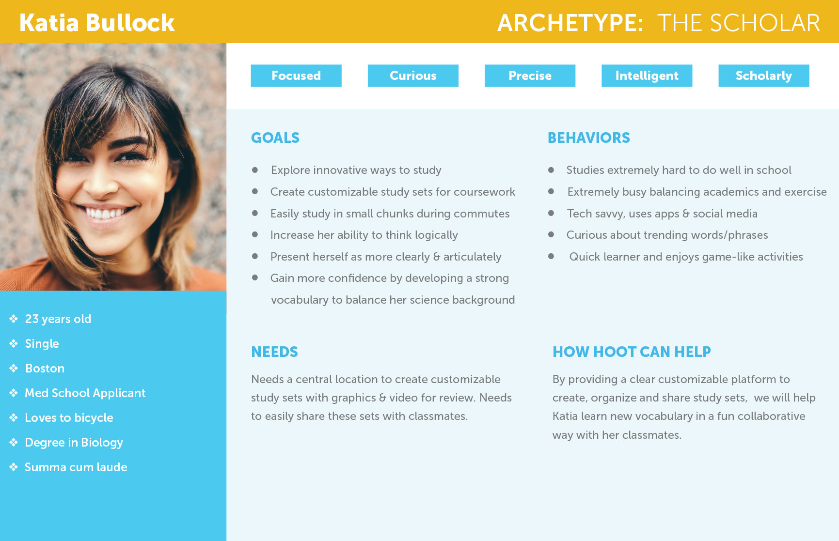
“As a busy graduate student balancing academics and life, I find that when I am learning new vocabulary I need to have the opportunity to digest things in small chunks, keeping my schedule efficient and focused.” —Katia

- Create an engaging experience to learn and practice new vocabulary
- Need a customizable place that can be easily referenced to organize multiple lists of study terms
- Succinct and efficient study sessions are required with the ability to be experienced in small chunks, offering the ability to jump in and out immediately
- App needs to be visually interesting and project an appealing fun factor to maintain enthusiasm
- Progress metric is needed to easily evaluate progress relative to learning goals.
- Access to other user’s libraries of curated shared interests is valued to stay aware of latest trends
- Who: People who are interested in learning new vocabulary and are comfortable using mobile applications
- What: A mobile application focused on learning new vocabulary using Imagery, audio and video to encourage and reinforce learning concepts
- When: App is intended to be used for on-the-go quick 5-10 minute study sessions.
- Where: Anytime or place a user has a short period of time to jump in and out. On a bus or train, between classes, on lunch breaks etc.
- Why: Users need an engaging efficient way to carefully categorize, reference and study new vocabulary and concepts so they can move forward confidently in their chosen field

- Creating an app which combines a stylish aesthetic with a simple intuitive interface of fun learning activities will help users become more engaging communicators and keep them inspired while studying new vocabulary.
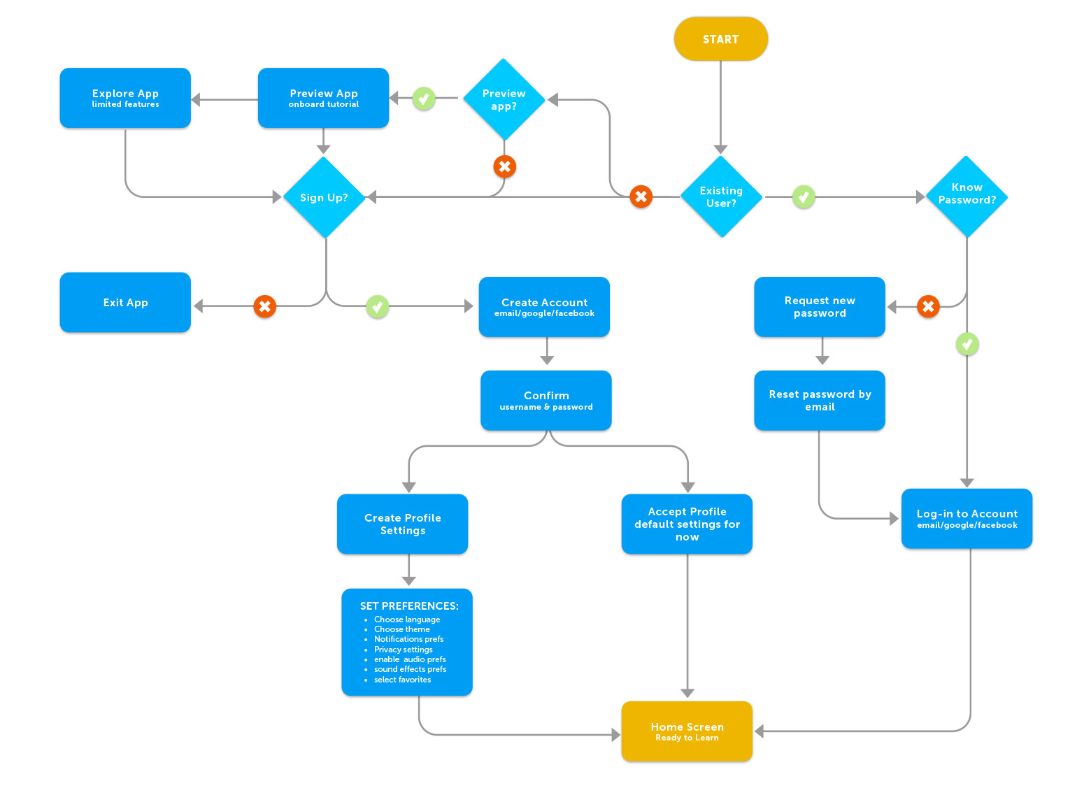
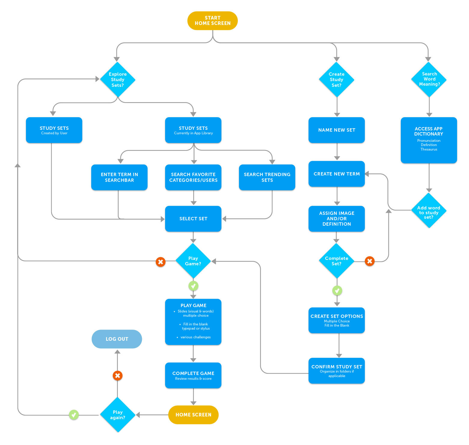
INFORMATION ARCHITECTURE
Now that I understood the needs of my users, I began to map out user flows, identifying the main tasks my personas would need to accomplish their goals. I was able to outline journeys that users would take through the information space of the app.
These flows helped me to create particular arrangements and specific sequences of activities, beginning to organize content and structure the initial navigation approach of the app.
Creating these user task flows also helped me to structure the paths that users would follow through my app in order to achieve their goals. Each user might choose a different path depending upon their specific information needs, perhaps stopping to explore different pieces of information along the way.
The main flows I focused upon were the onboarding sequence, and the process of creating and testing study sets.
Onboarding
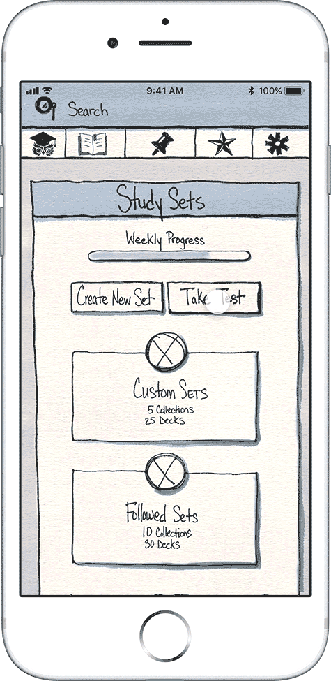
Create & Test Study Sets
CONCEPT SKETCHES
Quick. Ambigious. Accessible. Versatile.
One of the most wonderful things about a sketch is that it acknowledges the incomplete nature of ideas and leaves room for visual exploration and ideation. Its one of my favorite parts of the design journey.
My next step was to sit down and quickly sketch out basic low-fidelity wireframe concepts exploring my initial design ideas. Sketches are great to explore lots of ideas very quickly. Its a great way to work because while not everyone might understand complex wireframes and visual designs, sketches are universally understood, creating a shared understanding of ideas and concepts.
Working rapidly while using a grid template for consistency I was able to create multiple ideas for various parts of my app without spending the time to fully flesh each concept out. It was great to get all the ideas out on paper in some form and then be able to look back at them all as a group to see how they might work together.
WIREFRAMES
Building upon my sketches I created digital wireframes to begin creating a visual representation of the interface. I looked closely at the concepts I explored in my rough sketches and brainstormed solutions to create the structure and behavior of my app.
The wireframes were an exciting step as they began to show my initial research and ideas coming together in a tangible form. Starting with these low-fidelity frames, the mockups allowed me to focus on the fundamental structure and navigation over beautiful visual design and complex features.
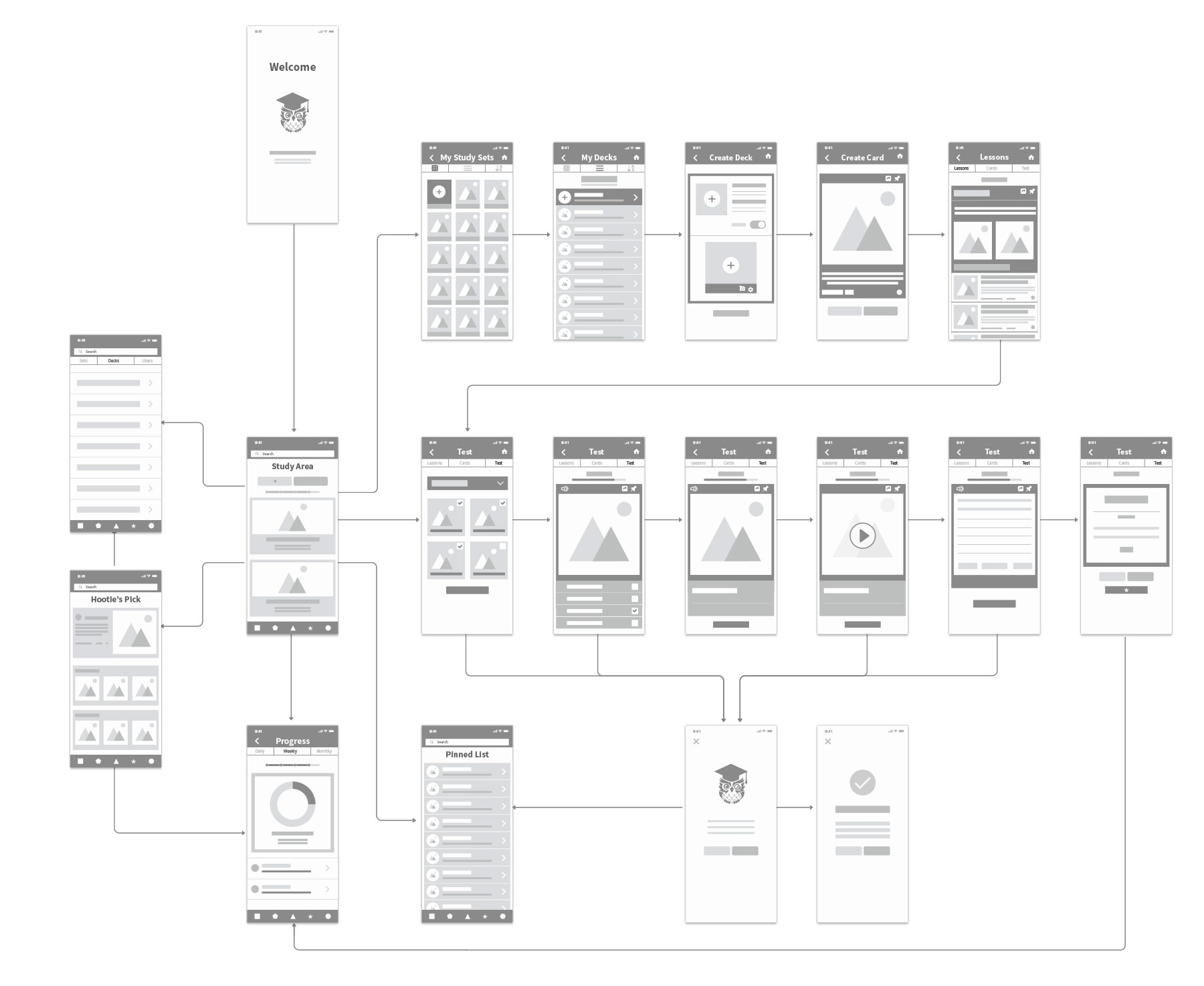
Using my sketches as a guide I was able to quickly build my first digital mockups in Sketch using symbols and styles which made building the templates really easy. Expanding upon my task flows I created in my information architecture exploration, I further explored the activities of onboarding, creating and testing the study sets.
User Flow: Onboarding

User Flow: Study Area
PROTOTYPING
I wanted to make sure to create a meaningful relationship between my users and product so I was eager to begin testing my ideas as soon as possible. Using Prott I linked my sketches together to create my first interactive prototype and presented it to potential users to try to learn as much as possible about how they would interact with my initial concepts. The prototype was great to focus on specific interactions and tasks, as opposed to fleshing out all the features and functionality at once.
My goal was to create the simplest prototype possible in order to have the users begin testing it. Watching testers in real-time moving through my app helped me to see what was successful and what needed more work. Following this process I could move forward confidently knowing that my design decisions were human-centered, tested with the real behavior of potential customers.
I repeated this prototyping, testing and refinement process several times, each time measuring the usefulness of that current iteration, updating, tweaking and revising to improve and ensure the app was designed with the users needs and challenges at the forefront.
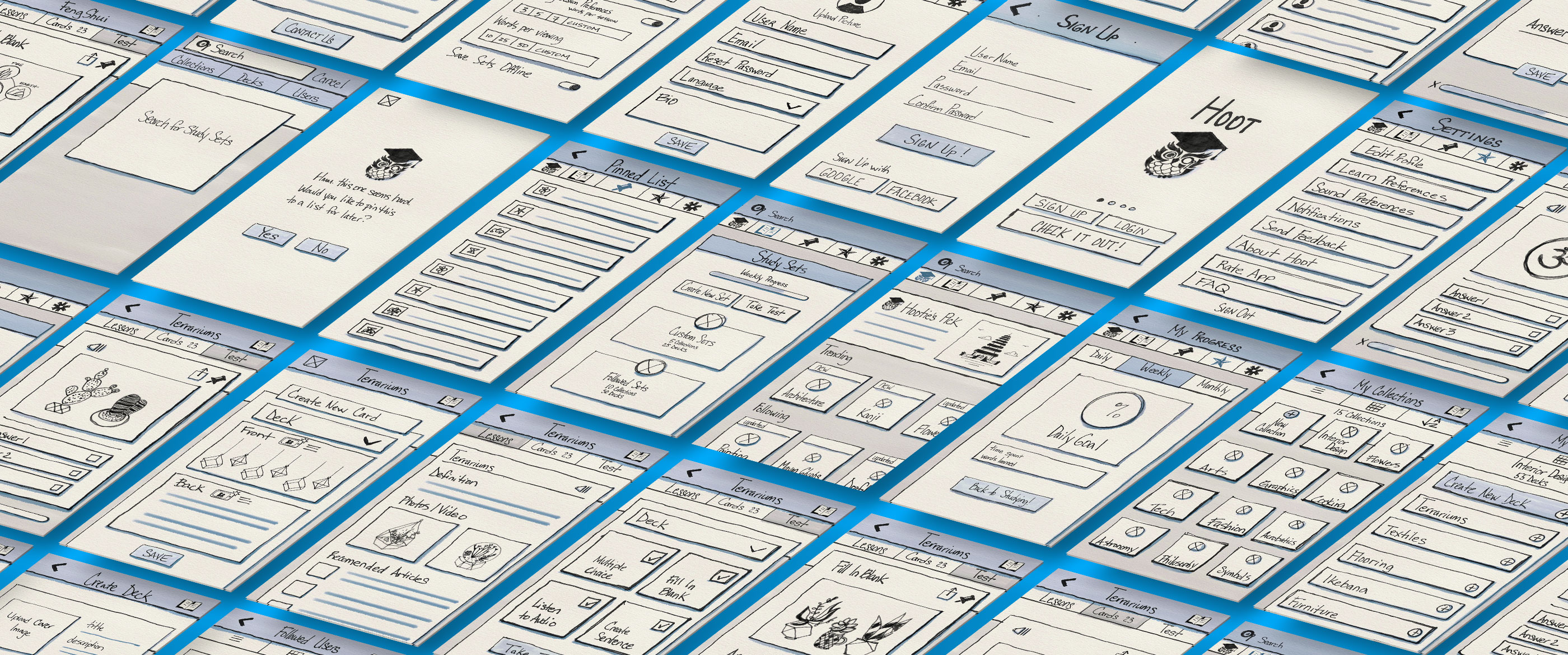
 Onboarding & settings

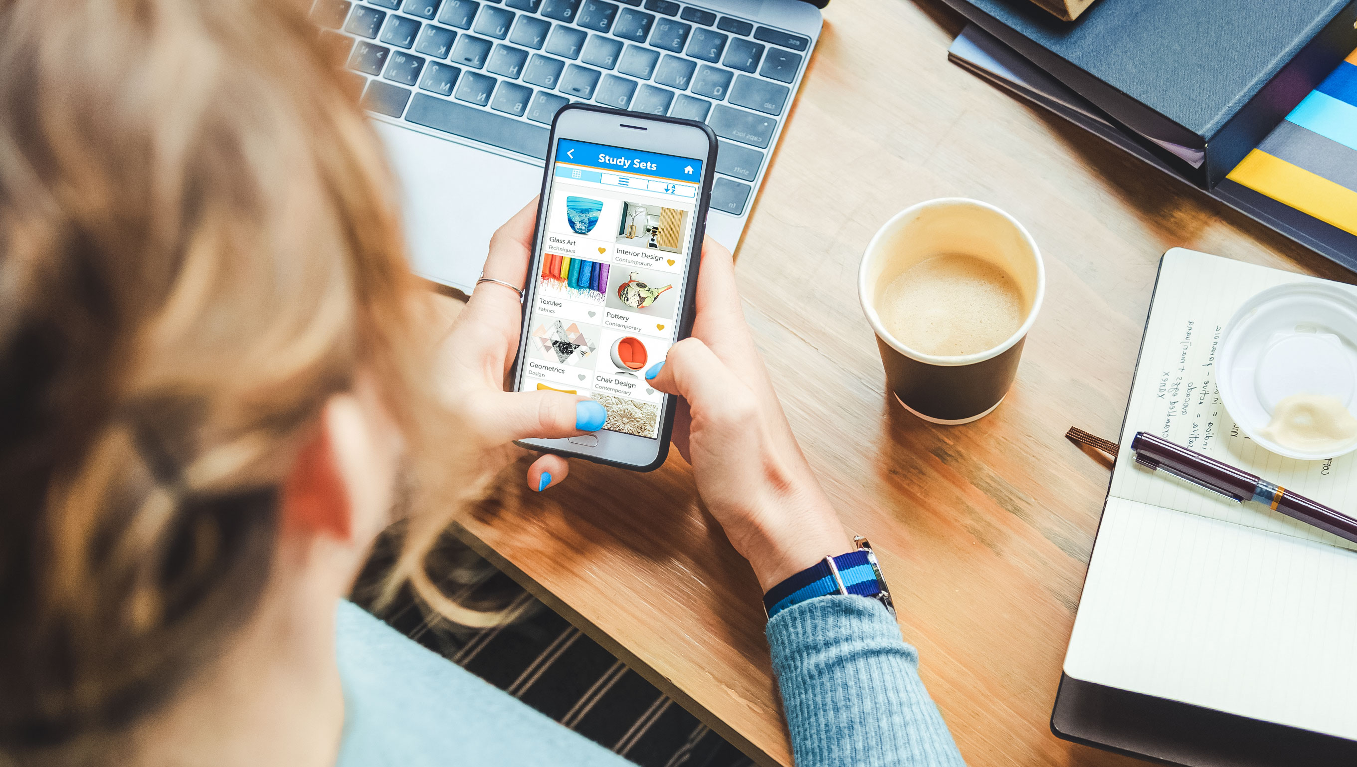
Navigation
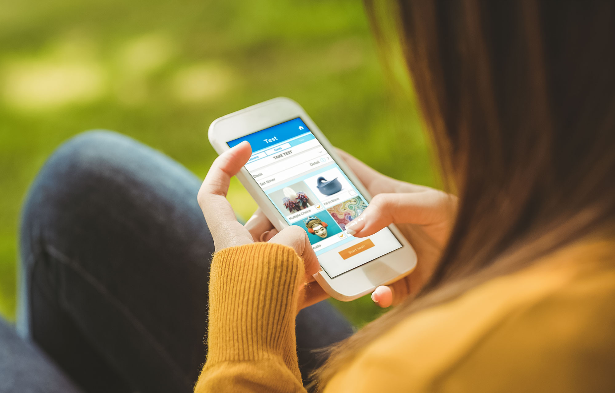
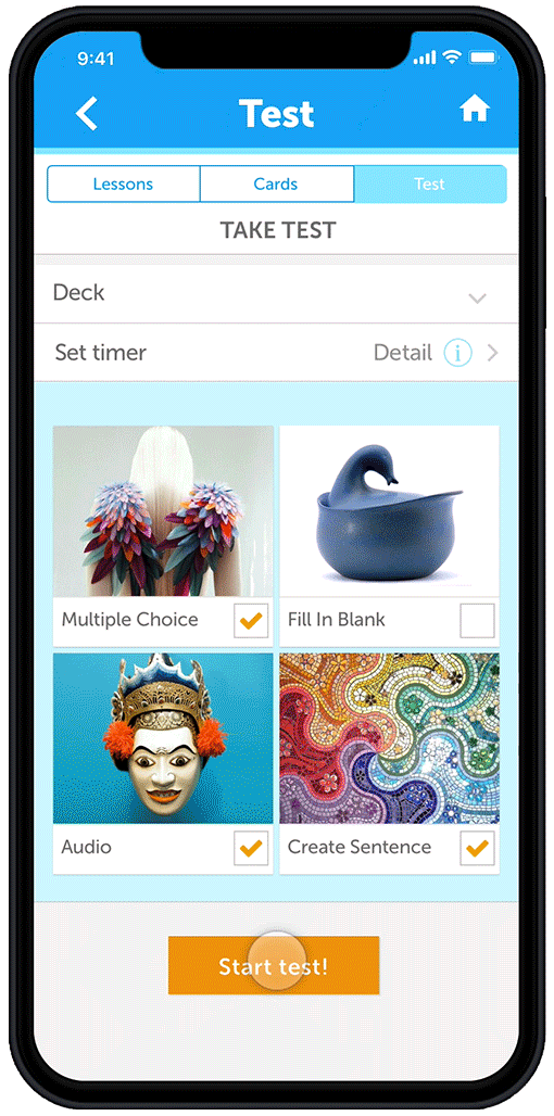
Vocabulary testing options
These initial prototypes were a great way for me to explore design patterns as I was faced with the challenge of creatively expressing my design solutions, but making sure that the layout was familiar to my users. I studied key mobile patterns for Onboarding, Logins and Navigation to make sure I was creating a structure that encouraged users to easily and effectively move through my information space.
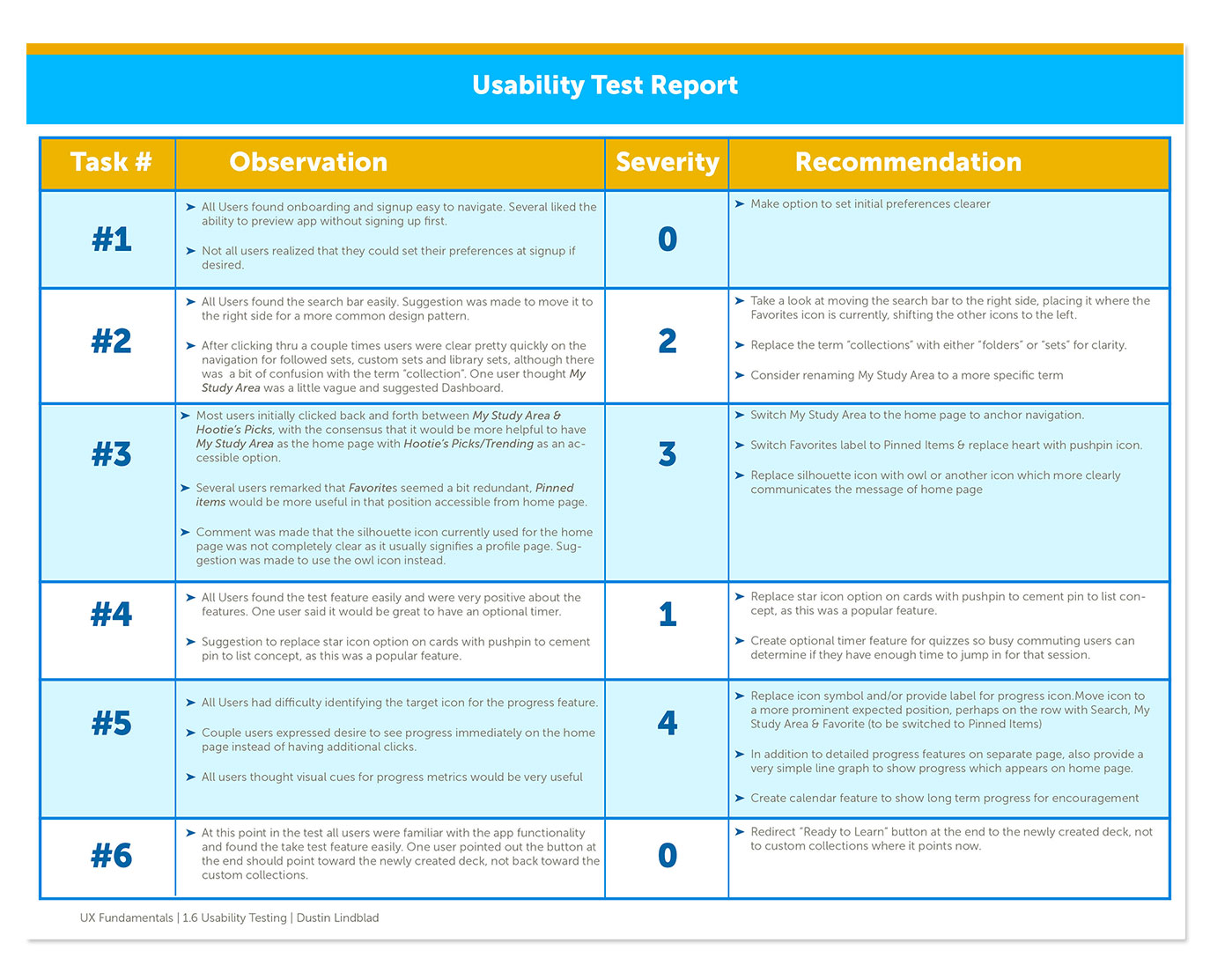
USABILITY TESTING
After building my initial prototype, I was excited to measure its usefulness by watching real people interact with it. My goal at this stage was to evaluate the ability or inability of users to complete specific tasks with my app and find out how well it was actually working for my users’ needs.
I designed a usability test plan and script which included the primary tasks I had identified in my strategy and persona stages. Would the users be able to complete their key tasks using my prototype? I wanted to find out.
I conducted six usability tests with five participants and took detailed notes on issues that came up as they completed the requested tasks. I carefully watched the efficiency, ease and speed with which they approached each task and evaluated the process. It was a great way to evaluate what people say and do while interacting directly with my product and provided valuable insight on how to fix several problems that appeared!
I synthesized my notes and observations into a usability test report and jumped back in to work on my revisions, making modifications based directly on feedback and observation.

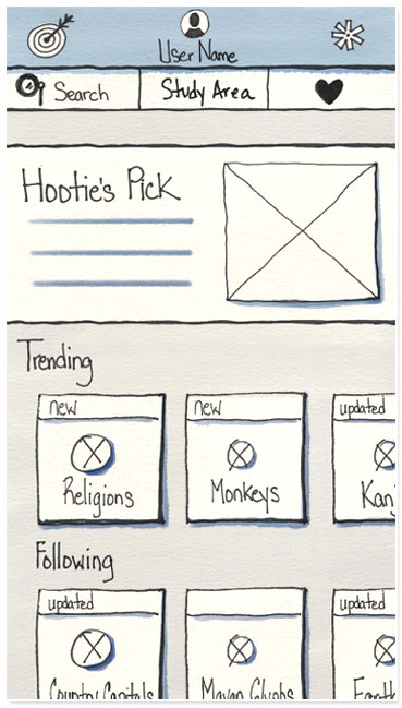
Hootie’s Picks
Homescreen before testing
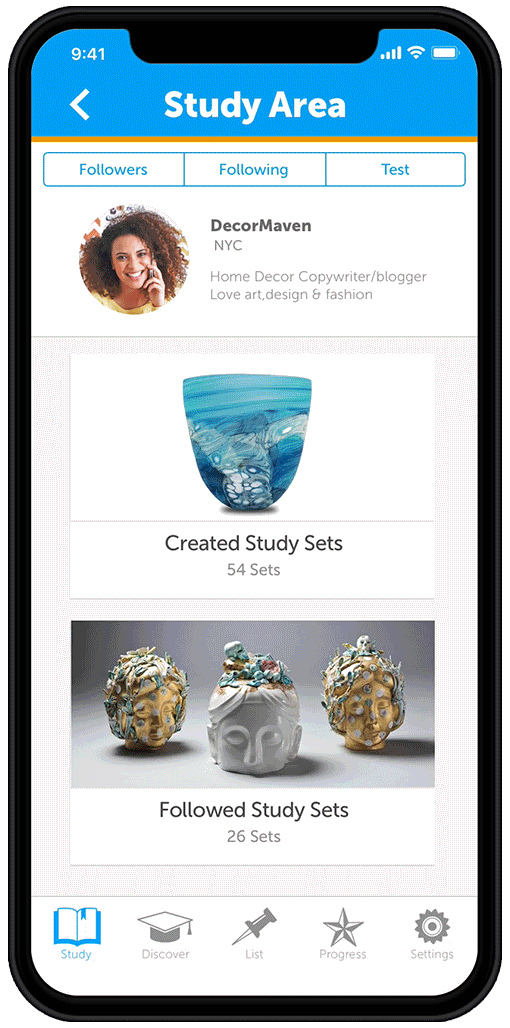
 Study Area
Homescreen after testing
Navigation Revisions
FEEDBACK:
- Users did not feel that that Hootie’s Picks was the best way to anchor the app with a home base.
- Users preferred to have the Study Area as the home page with Hootie’s Picks & Trending as an accessible option
MODIFICATIONS:
- Study Sets became the home page to anchor the navigation and is accessed by book icon
- Owl icon added to clearly communicate Hootie’s Pick & Trending
- Pinned Items List is accessed by a pushpin icon which replaces Favorites
- Star icon now accesses progress metrics
- Gear icon symbolizing settings moves to main navigation bar to consolidate features
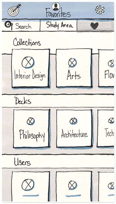
Favorites
Feature before testing
 Pinned List
Added after testing
Pinned List feature added
FEEDBACK:
- Several users remarked that a Favorites category seemed redundant for study sets.
- Users suggested that a list of Pinned Items to review later would be more useful.
MODIFICATIONS:
- Pinned List feature added to replace Favorites page
- Pushpin Icon added to access Pinned List,
- Pushpin icon also appears on the top right of all study cards to easily allow pin to list feature
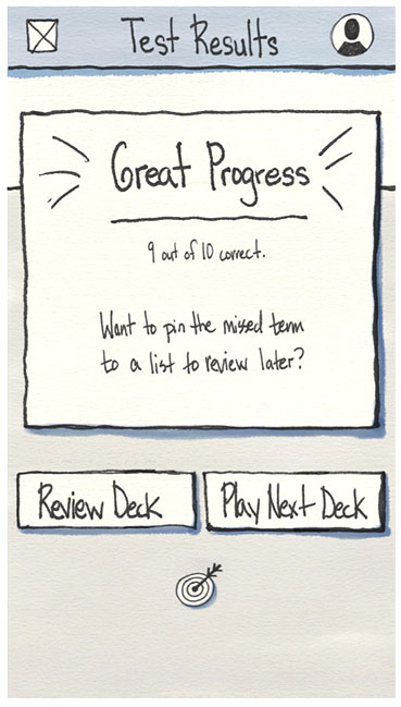
Progress Feature
Before testing
 Progress Feature
Icon design & location revised after testing
Progress Metrics
FEEDBACK:
- Users completely missed the target icon for the progress feature.
- The icon was not in an expected location
- Icon was not identified as symbolizing progress metrics.
- “Ready to Learn” button was confusing, as users were already in the process of studying
MODIFICATIONS:
- Star icon replaces the previous target icon for clarity and increased legibility.
- Star icon is moved to a “more expected position” in the main navigation bar to consolidate features and for immediate access to progress metrics
- “Back to Studying” button replaces “Ready to Learn”. Users thought this tagline made more sense after finishing a quiz.
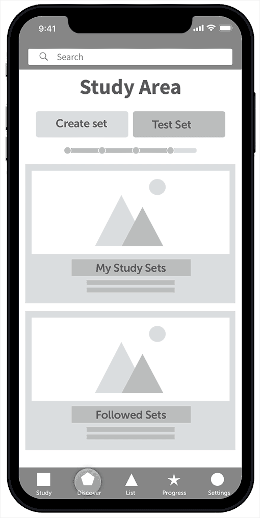
-
Navigation
FEEDBACK:
- Users would like more space at the top for content
- Owl icon too small to be legible
MODIFICATIONS:
- Flat navigation bar moved to the bottom with labels added for clarity
- owl icon replaced by simple mortarboard for quick read
- Apple iOS proportions introduced
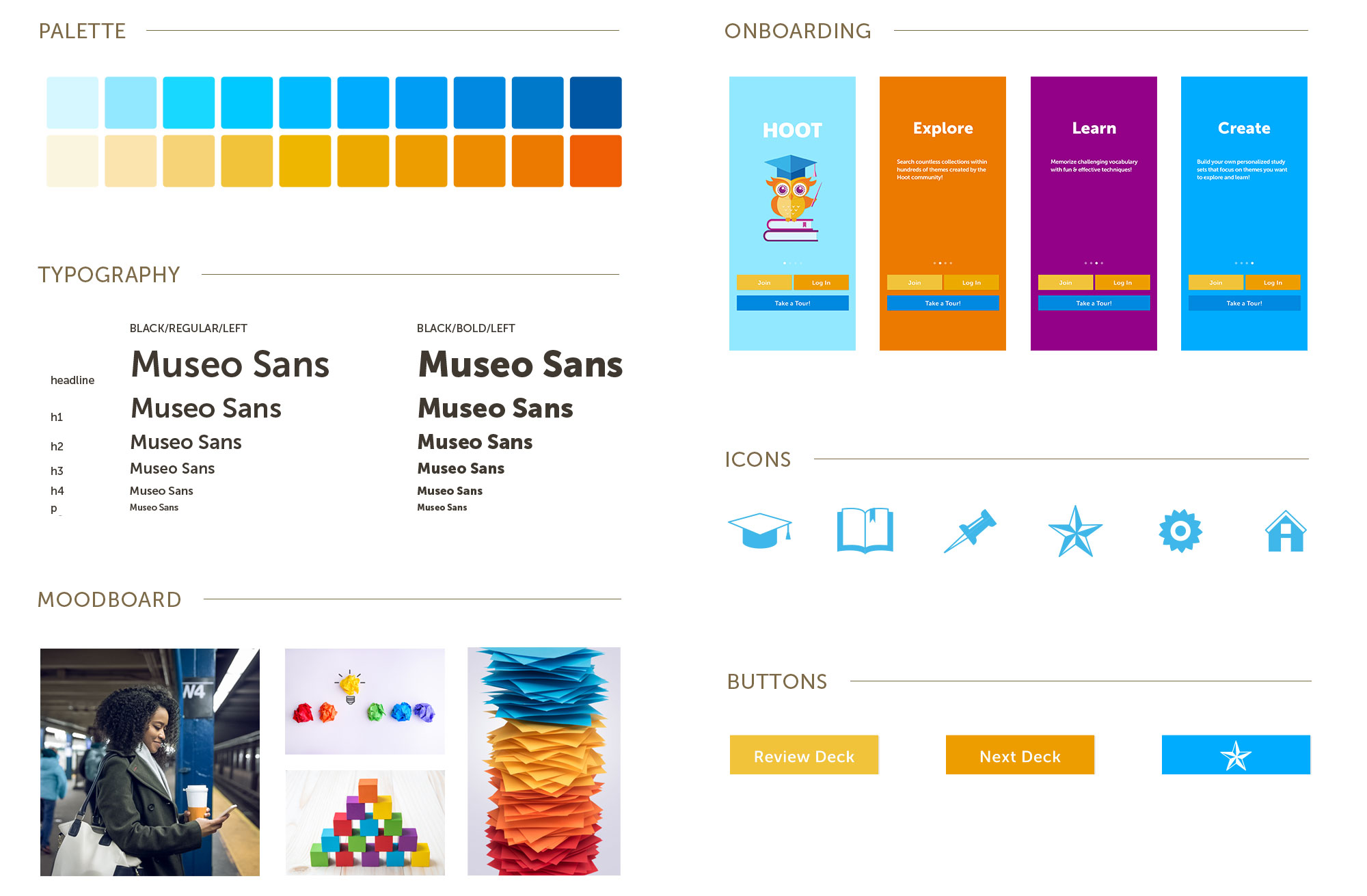
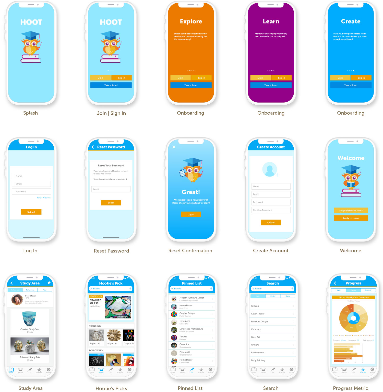
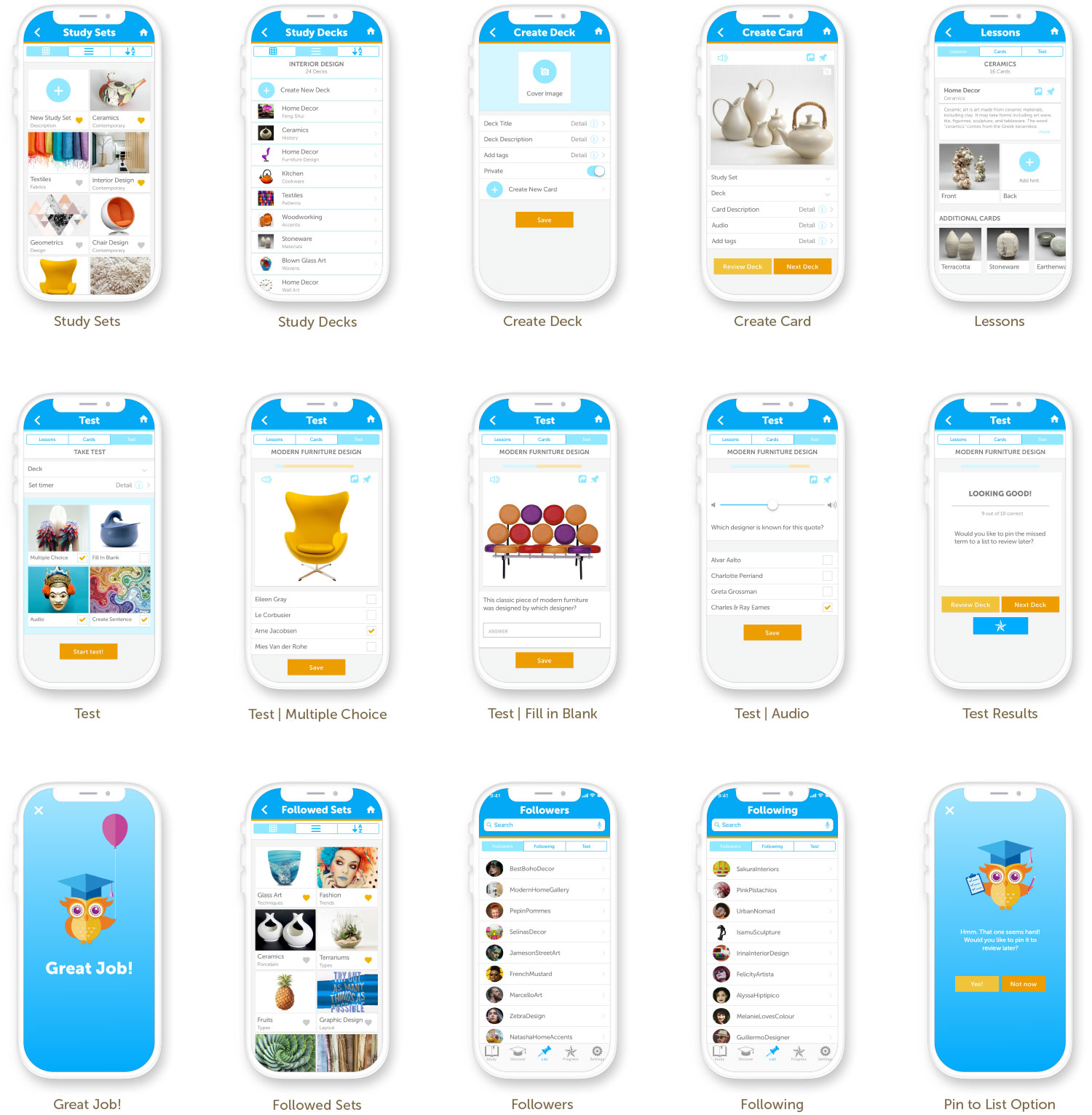
UI DESIGN

After many rounds of prototyping and testing, I was finally ready to create a high-fidelity mockup for my app!
Using Apple’s iOS Human Interface Guidelines as a guide and the knowledge I accumulated over my research and testing, I felt confident in creating a UI kit for my app that communicates the message effectively and creates strong brand awareness. I assembled a moodboard and design system, including typography, color palette and style tiles.
I chose bright bold crisp colors to communicate a feel of optimism and fun, but the blue palette also conveys an element of seriousness and commitment. I created the Hootie the owl mascot and the icons in illustrator and designed all my screens in Sketch. Using the Craft plugin, I easily uploaded my screens to Invision and created my high-fidelity prototype.

Onboarding & setting preferences
Main menu navigation
Vocabulary & concept testing options
UI KIT
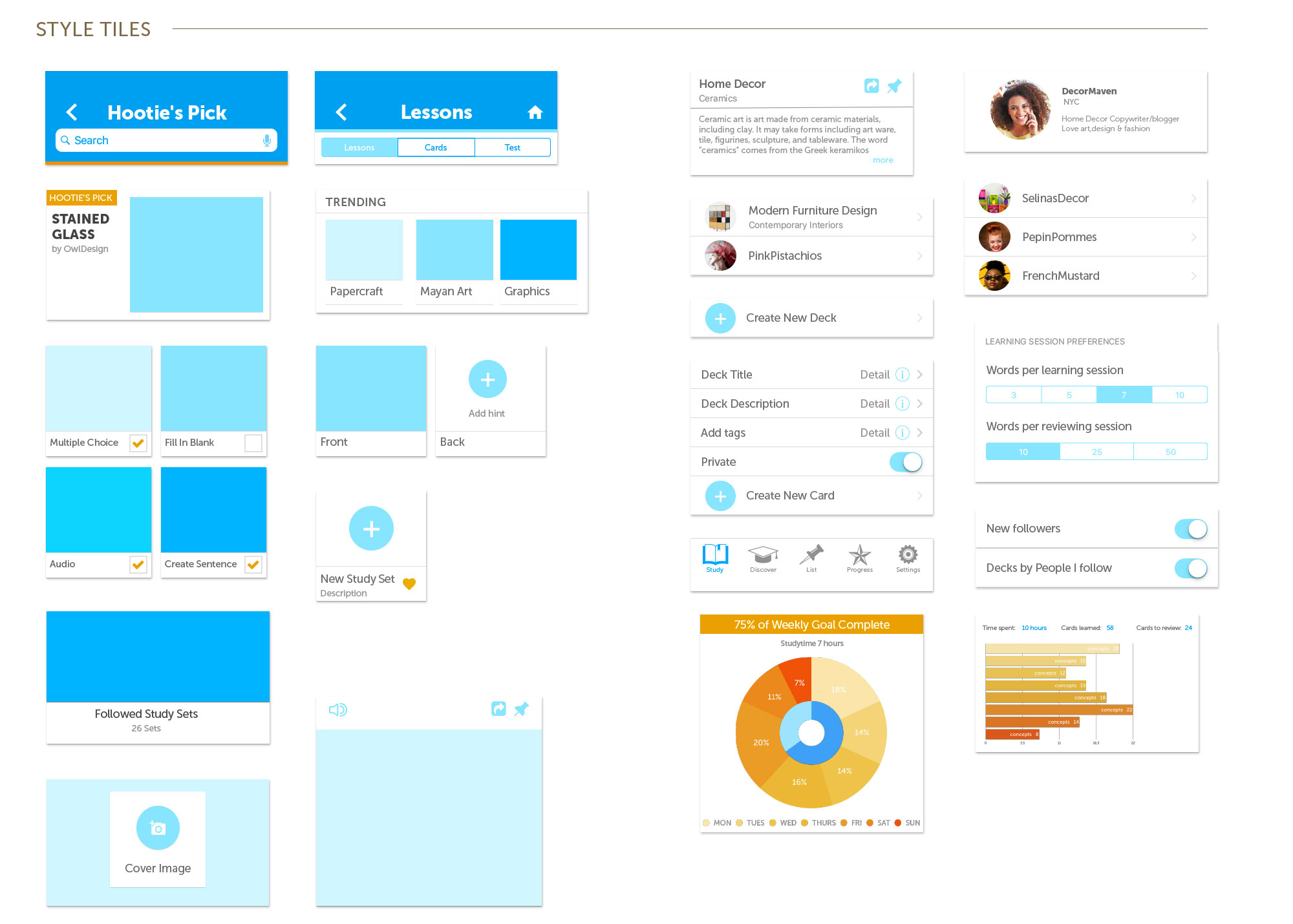
UI Screen Designs
REFLECTION
My goal is to create products which people love to use and this case study provided many lessons for me regarding experience design strategy, user research, information architecture, and interaction design. I truly enjoyed working through this project and learned a tremendous amount about listening, observation, and of course design.
Working through the various stages was challenging and rewarding as I learned how to organize and strategize concepts while identifying problems and solutions. I learned the power of working iteratively, testing and more testing in order to make sure the needs of the user were met. It was exciting to watch users interacting with my app and giving me realtime feedback and recommendations on how I might make it better.
And who knows? Maybe Hoot might be in the app store one day soon!